WinSavvy Editorial Standards
How this article was created
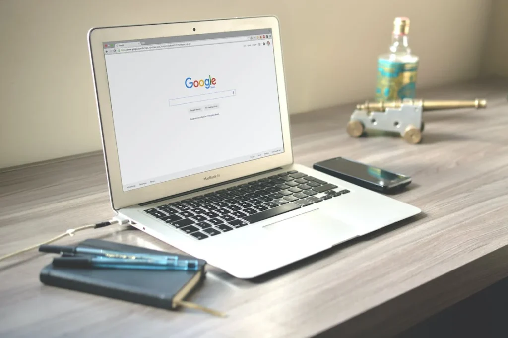
You’ve just launched a new website and already it’s time to increase conversion rates. Sorry…not so fast. You need to check your website design!
You can’t just launch a new website up on the Internet and expect conversions to start rolling in. You need to give it time, test different things and see what works best for your best for your business model.
You may have done everything right: You’ve created a great looking website, added compelling copy and killer features. But before you get too excited about your success rate, there’s one more thing to consider: The design of your site.
Here are 33 website design features that hurt conversions & ways to fix them!
#1. Improper Structure
The most important part of your website is the structure. The structure of your website is what makes it easy to navigate and find what you are looking for. It’s also what helps drive conversions and lead to better sales outreach.
A poorly structured site can hurt your conversion rates in a number of ways:
- If visitors can’t easily find what they’re looking for, they will leave your site and go somewhere else and may not return to your site because it’s too frustrating to use.
- If visitors can’t easily find what they’re looking for, they may abandon their shopping cart if the process takes too long (or if they don’t see an order button).
- If your site is poorly structured, visitors may not see important information and features that could help them make a purchase.
To properly structure a website for better conversion rates, several steps can be undertaken:
1. Make sure the website has clear navigation:
Users should be able to easily find what they are looking for on your website. This can be achieved by organizing the content into clear categories and providing a search bar or other navigation tools.
2. Include prominent calls to action:
Calls to action, such as “Sign up now” or “Buy now,” should be clearly visible on the website and stand out from the surrounding content. This will help guide users towards taking the desired action.
3. Optimize for mobile:
As mentioned earlier, more and more users are accessing the internet on mobile devices. To ensure that your website is mobile-friendly, consider using responsive design and testing the website on different devices.
4. Use trust indicators:
Trust indicators, such as customer reviews, security badges, and money-back guarantees, can help build trust with users and encourage them to take action on your website.
5. Make sure the website loads quickly:
Slow loading times can be frustrating for users and can lead to lower conversions. To improve loading times, consider optimizing images, minifying CSS and JavaScript, and using a content delivery network.
#2. Outdated Design
If your website is not up to date, it can lead to poor conversion rates.
A website that is out of date will not only look unprofessional but will also make your business look unprofessional. Your website design should match the theme of your business. For example, a law firm website should not be similar to that of an event management website. On that note, various business intelligence tools can be used for understanding how your competitors are doing it and then replicating the same.
Some of the reasons why an outdated website design can affect your conversion rates:
1. Poor user experience –
This is the most important reason why an outdated website design can lead to a drop in conversions. If your website doesn’t work as it should and looks old, it may affect the user’s experience and they will be less likely to buy from you or contact you.
2. Confusing navigation –
Navigation on websites is very important as it allows users to move around easily within a site without getting lost or frustrated trying to find what they’re looking for. When visitors come across a site that doesn’t offer them any clear direction or instructions on how they should proceed through the site, they become frustrated and ultimately leave without completing their intended task.
3. Slow loading time –
Users are impatient, especially when browsing the web. If a site takes longer than 30 seconds to load, most people will simply leave and find another site that loads quicker.
Steps to fix the issue of an outdated website design:
1. Conduct a thorough website audit:
This will help you identify any specific problems with your website’s design, such as poor navigation, lack of calls to action, or slow loading times.
2. Update the website design:
Once you have identified the issues with your website’s design, you can start updating it to make it more user-friendly and effective at converting visitors. This may involve updating the layout, adding trust indicators, and improving the mobile experience.
3. Test the updated design:
Before fully implementing the updated design, it is important to test it to ensure that it is effective at improving conversion rates. You can do this by running A/B tests or multivariate tests which compare the performance of the old and new designs, to see which one performs better.
4. Implement the updated design:
After testing the updated design and ensuring that it is effective at improving conversion rates, you can implement it on your website.
#3. Improper Implementation of Flat Design
Flat design is the new trend that is taking over the web design industry. This is all about simplicity, minimalism and cleanliness. It doesn’t use any gradients, shadows or textures in its design which makes it very simple, clean and easy to understand.
However, improperly implementing flat design can lead to poor conversion rates.
Issues with Flat Website Designs
1. Flat design often lacks visual hierarchy-
This makes it difficult for users to quickly understand the structure and content of the website. This can lead to confusion and frustration, causing users to leave the site without taking any action.
2. Flat design often lacks clear calls to action-
CTAs are essential for guiding users towards taking the desired action on a website. Without clear calls to action, users may not know what to do on the site, leading to lower conversions.
3. Flat design can lack the visual cues and indicators-
These help users trust a website. Trust indicators, such as customer reviews and security badges, can help users feel more confident about taking action on a website. Without these indicators, users may be less likely to make a purchase or provide personal information.
To avoid a Flat Design of your website, you must:
1. Add visual hierarchy:
Visual hierarchy refers to the arrangement of elements on a page to guide the user’s attention and understanding. By adding visual hierarchy to a flat design, you can help users quickly understand the structure and content of the website, improving their experience and increasing conversions.
2. Include CTAs:
As mentioned earlier, CTAs(Calls to Action) are essential for guiding users towards taking the desired action on a website. By including clear calls to action in a flat design, you can help users understand what they are supposed to do on the site, leading to higher conversion rates.
3. Add trust indicators:
Trust indicators, such as customer reviews and security badges, can help build trust with users and encourage them to take action on your website. By adding these indicators to a flat design, you can improve the user experience and increase conversions.
4. Test the updated design:
Before fully implementing the updated design, it is important to test it to ensure that it is effective at improving conversion rates. You can do this by running A/B tests, which compare the performance of the old and new designs, to see which one performs better.
These points must be taken care of otherwise there would be an extra expense whenever you decide to go about on redesigning of the website.
#4. Muddled Messaging
When it comes to marketing, one of the most important things you can do is clearly communicate your message. The content marketing will be effective only when the message you are delivering is apt.
This holds true for website design as well. If you don’t have a clear message then you’re going to have a hard time converting visitors into customers.
Why to avoid Muddled Messaging in your Website Design?
It is important to ensure that the messaging on your website is clear and effective at communicating the value and offerings of your website because:
- Muddled messaging can make it difficult for users to understand what the website is about and what it offers. This can lead to confusion and frustration, causing users to leave the site without taking any action.
- It can make it difficult for users to understand what action they are supposed to take on the website. Without clear calls to action, users may not know what to do on the site, leading to lower conversions.
- Muddled messaging can make it difficult for users to trust the website and its offerings. Trust indicators, such as customer reviews and security badges, can help users feel more confident about taking action on a website. Without these indicators, users may be less likely to make a purchase or provide personal information.
How can this mistake in website design be avoided?
Steps to be undertaken are:
1. Identify your target audience:
Before designing your website, it is important to identify your target audience and understand their needs and preferences. This will help you create messaging that is relevant and compelling to your audience.
2. Develop a clear value proposition:
Your website’s value proposition is a statement that explains how your website is different from others and why users should choose your website over others. Developing a clear and concise value proposition can help users understand what your website offers and why they should take action on it.
3. Use clear and concise language:
When designing your website, it is important to use clear and concise language that is easy for users to understand. Avoid using jargon or technical language that may be difficult for users to understand.
4. Include clear calls to action:
This might seem as a repetitive point but calls to action are essential for guiding users towards taking the desired action on a website. By including clear calls to action on your website, you can help users understand what they are supposed to do on the site, leading to higher conversion rates.
#5. Wordy Content
Wordy content can be a major issue for website design, as it can lead to poor user experience and lower conversion rates.
It is important to ensure that the content on your website is concise and relevant, and that it is organized in a way that is easy for users to understand and navigate.
Here are some reasons why wordy content leads to poor conversion rates:
- It is bad for SEOs.
- It makes it difficult for readers to scan through the page quickly.
- It makes it difficult for readers to find what they’re looking for quickly.
- It doesn’t provide enough information about your products or services.
- It doesn’t provide enough information about your company or the employees behind it.
- It doesn’t tell a compelling story.
- It isn’t organized well and is difficult for readers to navigate through quickly.
Here are some tips for writing clear and concise content:
1. Use short sentences –
Long sentences can be difficult for readers to follow and can cause them to lose interest in your content. Break up long sentences into shorter ones to make your message easier to digest.
2. Use active voice –
Passive voice makes sentences longer, more complicated and harder to follow than active voice. Use active voice whenever possible so that your writing flows more smoothly and makes sense more quickly.
3. Use bulleted points –
Bulleted lists give readers an easy way to scan through what you’ve written without having to read every sentence carefully. They also provide quick reference points if they want to come back later or refer a friend or colleague who may not have time right now but needs the information fast!
4. Use subheadings –
Subheadings break up long sections of text and make it easier for people to navigate through your document without getting lost. They also make your writing more accessible by helping readers scan the information quickly and decide if they want to read it all, or just skim over some points.
#6. Slow Loading Speed
Slow loading times can be a major issue for website design, as they can lead to poor user experience and lower conversion rates. It is important to ensure that your website has fast loading times to improve the user experience and increase conversion rates.
Reasons why slow loading speed is an issue:
- Slow loading times can be frustrating for users and can cause them to leave the site before it finishes loading. This can lead to a poor user experience and lower conversion rates.
- It can impact the ranking of your website in search engine results. Search engines, such as Google, use loading speed as a factor when determining the ranking of a website. If your website has slow loading times, it may rank lower in search results, which can lead to lower traffic and lower conversion rates.
- Slow loading times can impact the performance of your website on mobile devices. With more and more users accessing the internet on mobile devices, it is important for websites to be optimized for mobile. If a website has slow loading times, it may be difficult for users to use on their mobile devices, leading to lower conversion rates.
Ways to fix slow loading times in your website:
1. Conduct a website audit:
This will help you identify any specific issue that may be causing your website to have slow loading times, such as large images, unoptimized code, or a lack of caching.
2. Optimize images:
Large images can significantly slow down the loading times of a website. To fix this issue, you can optimize the images on your website by reducing their file size and using appropriate image formats.
3. Minify CSS and JavaScript:
CSS and JavaScript files can add to the overall size of a website and slow down its loading times. To fix this issue, you can minify these files by removing any unnecessary characters, such as white space and comments.
4. Use a content delivery network:
A content delivery network (CDN) is a network of servers that deliver content to users based on their geographic location. Using a CDN can help improve the loading times of your website by reducing the distance that the content has to travel to reach the user.
#7. Stock Images
Not only does your website need to be visually appealing, but it also needs to have a professional look and feel about it.
A lot of times, when you see a site that has stock images used throughout it, you get the feeling that it’s not trustworthy or reliable. This can make potential customers lose interest and want nothing to do with your product or service offerings.
When you use stock images in your website design, potential customers will think that either:
You don’t care about quality; or
You’re not willing to invest in your business/website; or
You’re just another fly-by-night company that doesn’t know what they’re doing.
Reasons of low conversion rates due to stock images are:
- Stock images can appear generic and unoriginal, which can make a website look unprofessional and unappealing to users.
- The images can be overused and appear on multiple websites, which can make a website look unoriginal and not unique. This can make it difficult for users to differentiate your website from others and may cause them to leave the site without taking any action.
- These images may not accurately represent your business or offerings, which can lead to confusion and mistrust among users. If users see images on your website that do not accurately reflect what your business offers, they may be less likely to trust the website and take action on it.
So, how do you avoid this?
1. By having a professional designer create your website:
A professional web designer will know what types of images to use on your site, as well as where and how to place them in order to make sure that they don’t look out of place. They’ll also know how to make them look good on any device (computer, tablet or mobile phone).
2. By making sure that the images on your site are relevant:
If you’re trying to sell a product or service, it’s important that the images you use in your website reflect what people will be getting from you if they make a purchase. This can be done by using carefully selected stock photos or hiring an artist to create custom artwork for your site.
3. By making sure that the images are eye-catching:
You want each of your images to catch people’s attention, but not in a way that makes them feel like they’re being bombarded with sales pitches. A good way to do this is by using images that reflect the theme of your site or blog.
For example, if you’re trying to sell a product for dogs, then make sure that you use pictures of dogs in all of your promotional materials (even if it’s just an image on a button).
4. Test different images:
Before deciding on the images for your website, you can test different images to see which ones perform best. You can do this by running A/B tests, which compare the performance of different images, to see which ones have the greatest impact on conversion rates.
#8. Complex Website Navigations
Complex website navigation can be a major issue for website design, as it can lead to poor user experience and lower conversion rates.
Problems with complex navigations in websites are:
1. Complex navigation can make it difficult for users to find the information they are looking for on a website.
If a website has a complex navigation structure, users may become frustrated and they’ll be unable to find what they are looking for, leading to a poor user experience and lower conversion rates.
2. Complex navigation can make a website appear cluttered and unorganized.
If a website has too many navigation options, it can look overwhelming and unappealing to users, causing them to leave the site without taking any action.
3. Complex navigation can make it difficult for users to understand the structure and content of a website.
If a website has a complex navigation structure, users may not be able to quickly understand the organization and content of the website, leading to confusion and lower conversion rates.
It is important to ensure that the navigation on your website is clear and intuitive, and that it helps users quickly find the information they are looking for.
Ways to ensure clear navigations are:
1. Identify the most important pages on your website:
This will help you determine which pages should be included in the main navigation of your website.
2. Organize the navigation structure:
The navigation structure of your website should be organized in a way that is logical and intuitive for users. This may involve using a hierarchy of pages, with the most important pages at the top and sub-pages organized underneath.
3. Use clear and concise labels for navigation options:
The labels for the navigation options on your website should be clear and concise, and should accurately reflect the content of the pages they link to. Avoid using vague or technical language that may be difficult for users to understand.
4. Test the updated navigation structure:
Before fully implementing the updated navigation structure, it is important to test it to ensure that it is effective at improving the user experience and conversion rates. You can do this by running A/B tests, which compare the performance of the old and new navigation structures, to see which one performs better.
#9. Multiple User Choices
It is important to ensure that the options on your website are limited and well-organized, and that they help users quickly make a decision and take action on your website.
Multiple user choices can be used to give customers more control over their experience and help them find exactly what they’re looking for.
Multiple user choices in website design can end up hurting your website design in the long run:
1. Multiple user choices can make it difficult for users to make a decision on a website.
If a website offers too many options, users may become overwhelmed and unsure of which option to choose, leading to indecision and lower conversion rates.
2. These can make a website appear cluttered and unorganized.
If a website has too many options, it can look unappealing to users, causing them to leave the site without taking any action.
3. Multiple user choices can make it difficult for users to understand the structure and content of a website.
If a website has too many options, users may not be able to quickly understand the organization and content of the website, leading to confusion and lower conversion rates.
Ways to fix the issues with multiple user choices are:
1. Identify the most important choices on your website:
This will help you determine which options are essential for users to make a decision on your website.
2. Organize the choices effectively:
The choices on your website should be organized in a way that is logical and intuitive for users. This may involve using a hierarchy of options, with the most important choices at the top and sub-options organized underneath.
3. Use clear and concise labels for the choices:
The labels for the choices on your website should be clear and concise, and should accurately reflect the content of the pages they link to. Avoid using vague or technical language that may be difficult for users to understand.
4. Test the updated choice structure:
Before fully implementing the updated choice structure, it is important to test it to ensure that it is effective at improving the user experience and conversion rates. You can do this by running A/B tests, which compare the performance of the old and new choice structures, to see which one performs better.
#10. Color Overuse
Be it designing a business or website, color usage must be apt everywhere. Color is one of the most important elements in web design. It is used to draw attention, set a mood, and create visual interest. However, if you overuse color in your website design, it can have a negative effect on your conversions.
Issues with overusing colors in designing a website:
1. Color overuse can make a website appear cluttered and unorganized.
If a website uses too many colors, it can look overwhelming and unappealing to users, causing them to leave the site without taking any action.
2. Color overuse can make it difficult for users to focus on the important elements of a website.
If a website uses too many colors, it can be difficult for users to distinguish between the different elements of the site, leading to confusion and lower conversion rates.
3. Color overuse can impact the readability of a website.
If a website uses too many colors, it can make the text on the site difficult to read because of various shades, leading to a poor user experience and lower conversion rates.
Steps to fix the issues with color overuse:
1. Use a limited color palette:
To avoid color overuse, it is important to use a limited color palette on your website. This may involve choosing a few main colors and a few accent colors, and using them consistently throughout the website.
2. Use color to highlight important elements:
Instead of using color excessively, you can use it strategically to highlight the most important elements on your website. This can help draw the user’s attention to the most important information and improve their experience on the site.
3. Use contrast to improve readability:
To improve the readability of your website, you should use colors with high contrast. This means using light colors on a dark background or vice versa, to make the text easy to read.
4. Test the updated color scheme:
Before fully implementing the updated color scheme, it is important to test it to ensure that it is effective at improving the user experience and conversion rates. You can do this by running A/B tests, which compare the performance of the old and new color schemes, to see which one performs better.
#11. Ad Banner Overuse
Ad banners are one of the most common ways to monetize a website. Options like Facebook Ads are being availed by many businesses for effective marketing. However, if used improperly, they can have a negative effect on your conversion rates and overall site traffic.
Overuse of Ad Banners can be disadvantageous in various ways:
First, ad banners can be intrusive and distracting for users, which can make a website less enjoyable to use. If a website has too many ad banners, it can be frustrating for users and may cause them to leave the site without taking any action.
Furthermore, ad banner overuse can make a website appear cluttered and unprofessional. If a website has too many ad banners, it can look overwhelming and unappealing to users, causing them to leave the site without taking any action.
Also, ad banner overuse can impact the credibility and trustworthiness of a website. If a website has too many ad banners, it can make the website appear spammy and untrustworthy, leading to lower conversion rates.
Ways to avoid the overuse of the Ad Banners:
1. Use ad banners sparingly:
Instead of using ad banners excessively, you can use them sparingly on your website. This may involve limiting the number of ad banners on each page and ensuring that they do not distract from the main content of the website.
2. Use relevant ad banners:
To avoid ad banner overuse, it is important to use ad banners that are relevant to the user. This means choosing ad banners that are related to the content of the website or the interests of the user, to improve the relevance and effectiveness of the ads.
2. Use ad banners that are not intrusive:
To avoid ad banner overuse, you should use ad banners that are not intrusive to the user. This means using ad banners that do not block the main content of the website or interrupt the user’s experience.
3. Test the ad banner placement:
Before fully implementing the ad banner placement, it is important to test it to ensure that it is effective at improving the user experience and conversion rates. You can do this by running A/B tests, which compare the performance of different ad banner placements, to see which ones have the greatest impact on conversion rates.
#12. Unequally Weighed CTAs
The success of a website is determined by how you are able to drive traffic to it. To get people to visit your site, you need to attract them with compelling content and relevant products.
CTAs are crucial when it comes to online marketing as they help in driving traffic to your website. They can prove to be strategic way of marketing your business. If your CTAs do not entice visitors or if they are not appealing enough, then chances are that most people will ignore them entirely.
Problems that can arise due to unequal CTAs:
- The main issue with having too many CTAs on a page is that it can make the page look cluttered, which will turn off visitors who might otherwise convert if they weren’t distracted by all the other things on the page.
- Another problem with having too many CTAs is that it can lead people down the wrong path and force them to abandon their shopping cart before making a purchase.
For example, if you have one CTA for a free trial, another for signing up for an account and another for getting started with live chat support, visitors may click on the wrong one and end up leaving without purchasing anything because they didn’t realize they needed more information before signing up.
Suggestions to fix unequal CTAs:
1. Use clear, concise, and compelling language in your CTAs.
Avoid using vague or confusing language that may cause visitors to hesitate or become unsure of what to do next.
2. Make sure that your CTAs are prominently displayed on your website.
Place them in a location that is easily visible and accessible to visitors, such as near the top of the page or in the center of the screen.
3. Use contrasting colors for your CTAs to make them stand out from the rest of the page.
This will help to draw the visitor’s attention to the CTA and increase the chances of them taking action.
4. Use white space around your CTAs to give them breathing room and make them more prominent.
Avoid cramming too many elements onto the page, as this can make it difficult for visitors to focus on the CTAs.
5. Test different versions of your CTAs to see which ones perform best.
Use A/B testing to compare the performance of different versions of your CTAs, and make changes based on the results of the tests. This will help you to optimize your CTAs and improve your conversion rates.
#13. Unresponsive Design
Unresponsive design is when a website is not optimized for mobile devices. This means that the site doesn’t look good on a small screen and it also doesn’t function well.
The result is that people will not be able to use your site and they might even give up on you completely. This can lead to poor conversion rates and ultimately lower sales.
Why does it matter?
When someone visits your site on their mobile device, they expect to have an easy time navigating around. That’s why it’s important for your site to be responsive so that it can adapt to different screen sizes. If your site isn’t responsive, then customers won’t be able to view it properly on their phones or tablets. They’ll either have to zoom in on every page or just leave altogether because of frustration.
Negative Impacts of Unresponsiveness:
1. Unresponsive design can make it difficult for visitors to access and use your website on different devices.
If your website does not adapt to different screen sizes and resolutions, visitors may have a hard time navigating and interacting with it, which can lead to frustration and ultimately cause them to leave your site without taking any desired actions.
2. Unresponsive design can negatively impact the user experience.
Visitors are more likely to take action on your website if they have a positive experience while using it. If your website is difficult to use or navigate, visitors may not have a good experience, which can reduce the chances of them converting.
3. Unresponsive design can harm your search engine rankings.
Search engines like Google place a high value on websites that provide a good user experience, and may penalize websites that are difficult to use or navigate. If your website is unresponsive, it may not rank as well in search results, which can reduce the amount of traffic it receives and ultimately impact your conversion rates.
4. Unresponsive design can make it difficult for visitors to find the information they are looking for.
If your website is not optimized for different devices, visitors may have a hard time finding the information they need, which can lead to frustration and cause them to leave your site without taking any desired actions.
How to fix the problems?

1. Use a responsive design:
Responsive design is a design approach that ensures that a website’s layout and content adapts to the size and capabilities of the device it is being viewed on. This makes it easy for users to view and interact with your website on any device, improving their user experience and increasing the likelihood of conversion.
2. Optimize your website for mobile devices:
More and more users are accessing the internet on their mobile devices, so it’s important to make sure that your website is optimized for these users. This means using a design that is easy to navigate on a small screen, using large buttons and easy-to-read fonts, and avoiding using Flash or other technologies that may not be supported on mobile devices.
3. Test your website on multiple devices:
Before you launch your website, it’s important to test it on a variety of devices to ensure that it looks and functions as intended. This will help you identify any potential issues and fix them before they impact your conversion rates.
4. Keep your website up to date:
Technology and design trends are constantly evolving, so it’s important to keep your website up to date. This means regularly reviewing your website’s design and making updates as needed to ensure that it remains user-friendly and easy to navigate.
#14. Not Prioritizing Grids and Columns In Your Website Design
Grids are great for structuring information and creating balance within an interface. However, you should not just use grids to make things look good. As a designer, you have the responsibility of ensuring that the user can easily scan through your design and find what they need quickly. If you do not prioritize grids and columns in your designs, then you will be hurting the conversion rates of your website design.
Not prioritizing grids and columns in website design can be disadvantageous in various ways:
1. Disorganized and Cluttered Layout
A lack of grid or column structure can lead to a disorganized and cluttered layout, which can be confusing and difficult for users to navigate. This can make users less likely to stay on the site and take the desired action, such as making a purchase or filling out a form.
2. Misaligned Content
Without a proper grid or column structure, content on a website may not be properly aligned and spaced, which can make it difficult to read and understand. This can reduce the effectiveness of the website and make it less likely that users will convert.
3. Inconsistent and Unpredictable Layout
A website without a clear grid or column structure may not have a consistent and predictable layout, which can make it difficult for users to quickly find the information they are looking for. This can increase the time it takes for users to complete a task on the site and decrease the likelihood of conversion.
How can you prioritize grids and columns in website design?
Steps you can take to ensure that grids and columns are prioritized in your website design:
- Start by defining the overall layout and structure of your website, including the number and size of columns and the relationships between different elements on the page. This will provide a framework for organizing your content and ensure that it is properly aligned and spaced.
- Use a grid system to divide the page into consistent and predictable sections, and use columns within these sections to organize the content in a logical and easy-to-understand manner. This will make it easy for users to navigate the site and find the information they are looking for.
- Be consistent in your use of grids and columns throughout the website, and avoid using multiple grid or column systems on a single page. This will help to create a consistent and predictable layout that users can easily understand and navigate.
- Use whitespace and other design elements, such as color and typography, to emphasize the grid and column structure of your website and draw the user’s attention to important content. This will help to improve the visual appeal of the site and make it more engaging for users.
Overall, prioritizing grids and columns in website design is important because it can help to improve the user experience, aesthetic appeal, readability, and overall effectiveness of a website.
#15. Not Handling 404 Page Design affects SEO and Conversions
404 pages are unavoidable for any website. A 404 page is a web page that’s displayed when a user tries to access a page that doesn’t exist on your site. They help users to find their way back when they get lost on your site, and they also direct potential customers to the right places on your website.
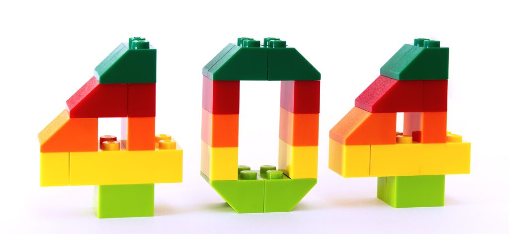
Why not having a proper 404 Page Design is Bad for your Website?
- A poorly designed 404 page can be confusing and frustrating for users, who may become frustrated and leave the site without taking the desired action, such as making a purchase or filling out a form. This can decrease the conversion rate of the website.
- A 404 page that is not properly optimized for search engines may not be indexed by Google and other search engines, which can make it difficult for users to find the site through search. This can decrease the visibility of the website in search results, which can hurt its SEO performance.
- A 404 page that is not linked to the main navigation of the website can make it difficult for users to find their way back to the main content of the site. This can increase the likelihood that users will leave the site without converting, which can hurt the conversion rate of the website.
To create a better 404 Page Design for your Website, follow the Steps:
- Start by including a clear and concise error message on the 404 page that explains to the user what has happened and why they are seeing this page. This can help to reduce frustration and confusion, and make it more likely that the user will take the desired action, such as returning to the homepage or searching for the information they are looking for.
- Include a search bar on the 404 page that allows users to search for the content they are looking for. This can help to improve the user experience and make it more likely that users will find the information they need, which can increase the likelihood of conversion.
- Link the 404 page to the main navigation of the website, so that users can easily find their way back to the main content of the site. This can help to improve the user experience and make it more likely that users will take the desired action, such as making a purchase or filling out a form.
- Optimize the 404 page for search engines by including relevant keywords and meta tags, and submitting the page to Google and other search engines for indexing. This can improve the visibility of the page in search results and make it more likely that users will find the site through search, which can improve its SEO performance.
#16. Excessive Use of Carousel Sliders
Carousel sliders, also known as image carousels or image sliders, are a common feature in website design. They are typically used to display a series of images or other visual content, such as videos or graphics, in a rotating or sliding format. Carousel sliders are often used to showcase products, highlight features, or display customer testimonials on a website.
But the excessive use of these sliders can lead to your loss!
How Excessive Carousel Sliders lead to Low Conversion Rates?
- Carousel sliders can be distracting and disruptive to the user experience, as they constantly move and change. This can make it difficult for users to focus on the content of the website and can lead to increased bounce rates, where users leave the site without taking the desired action.
- Carousel sliders often rotate or slide through the images at a fixed rate, which can be too slow or too fast for some users. This can make it difficult for users to read or view the content on the carousel, and can lead to a poor user experience.
- Carousel sliders are often used to display a large amount of content in a small space, which can make the content difficult to read and understand. This can reduce the effectiveness of the website and make it less likely that users will take the desired action, such as making a purchase or filling out a form.
- Carousel sliders can be difficult to navigate, especially on mobile devices, where the small screen size and touch-based interface can make it challenging for users to swipe or tap through the images. This can lead to user frustration and a poor user experience.
Measures to Fix the Issues with Carousel Sliders:
- Limit the number of carousel sliders on a single page to one or two, and avoid using multiple carousels on a single page. This can help to reduce the amount of movement and change on the page, which can make it easier for users to focus on the content of the website.
- Use carousel sliders that allow the user to control the speed at which the images rotate or slide, or use a carousel that automatically adjusts the speed based on the user’s interaction with the page. This can help to improve the user experience by allowing users to view the content at their own pace.
- Use carousel sliders to display a limited amount of content, and avoid using them to cram a large amount of information onto a single page. This can help to improve the readability and effectiveness of the content on the website.
- Use responsive design techniques to ensure that carousel sliders are easy to navigate on mobile devices, and include large, easy-to-tap buttons or arrows for controlling the carousel. This can help to improve the user experience and make it more likely that users will take the desired action on the website.
#17. Poor SEO Equity
Without SEO, it’s unlikely that anyone would find your website when they search for specific keywords on search engines like Google or Bing. SEO holds important for your website design because it helps drive traffic to your site. More traffic means more sales and leads, which can help grow your business.

Poor SEO equity can be bad for your website design in several ways:
- Poor SEO equity can make it difficult for your website to rank well in search engine results pages (SERPs), which can decrease the visibility of your website in search results. This can make it less likely that users will find your website through search, which can hurt the overall performance of the site.
- Poor SEO equity can lead to a low domain authority and a low page rank, which can make your website less credible and trustworthy in the eyes of users and search engines. This can decrease the likelihood that users will click on your website in search results, which can hurt the traffic and conversion rate of the site.
- Poor SEO equity can result in a high bounce rate, where users quickly leave your website after arriving from a search engine. This can indicate to search engines that your website is not providing a good user experience, which can decrease your search engine rankings and make it even harder for users to find your site.
- Poor SEO equity can make it difficult for your website to compete with other sites in your industry, as search engines will favor websites with strong SEO equity when determining the order of search results. This can make it more difficult for your website to attract users and achieve its desired goals.
To ensure good SEO equity, remember:
- Start by conducting keyword research to identify the most relevant and popular keywords for your website and its content. This will help you to create content that is optimized for these keywords, which can improve your search engine rankings and increase the visibility of your website in search results.
- Use meta tags, title tags, and alt tags to properly optimize your website’s content for search engines. This will help search engines to understand the content of your website and to index it properly in their search results.
- Create high-quality, unique, and informative content for your website that is valuable and useful to users. This will help to improve the user experience of your website, which can increase its credibility and trustworthiness in the eyes of both users and search engines.
- Use internal and external links to connect your website’s content to other relevant and reputable websites, which can help to improve your website’s authority and credibility in the eyes of search engines.
- Monitor and analyze the performance of your website in search results, and use this information to make improvements and optimize your SEO strategy. This will help you to continually improve your website’s SEO equity and to achieve your desired goals.
#18. Wrong Font Size
Too small or too large font size of your website can lead to a loss.
Correct font size is important for a good website design because:
- Correct font size ensures that the text on the website is easy to read and understand, which can improve the user experience and make it more likely that users will stay on the site and take the desired action, such as making a purchase or filling out a form.
- Using the correct font size can help to create a balanced and aesthetically pleasing layout for the website, which can improve its overall aesthetic appeal and make it more attractive to users.
- Correct font size can improve the readability of the website, which can make it easier for users to digest the information on the site and take the desired action.
- Using the correct font size can help to create a consistent and predictable layout for the website, which can improve the user experience and make it easier for users to navigate the site.
- Correct font size can ensure that the text on the website is accessible to users with visual impairments, who may use screen readers or other assistive technologies to access the content of the website.
To ensure the correct font size of your website, you can follow these steps:
- Start by choosing a font that is easy to read and has a clear and distinct appearance. Avoid using fonts that are difficult to read or that have a thin or decorative style, as these can make the text on your website hard to read.
- Set the default font size for your website to be large enough to be easily readable, but not so large that it takes up too much space on the page. A good starting point is to set the default font size to 16 pixels, which is a common default font size for web browsers.
- Use a responsive design approach to ensure that the font size adjusts automatically to the size of the user’s device or screen. This will ensure that the text on your website is always easy to read, regardless of the device or screen size that the user is using.
- Use font size scaling to adjust the font size of different elements on your website based on their importance or visual hierarchy. For example, you can use a larger font size for headings and subheadings, and a smaller font size for body text. This will help to create a balanced and hierarchical layout for your website.
- Test your website on different devices and screen sizes to ensure that the font size is always easy to read and that the overall layout of the website is balanced and aesthetically pleasing. This will help you to fine-tune the font size of your website and ensure that it is correct.
#19. Too Many Fonts

It is not a great idea to use too many font styles in you website design. The reasons for it are:
- Using too many fonts can make the website look cluttered and disorganized, which can be confusing and difficult for users to navigate. This can make it less likely that users will stay on the site and take the desired action, such as making a purchase or filling out a form.
- Using too many fonts can make the website appear unprofessional and amateurish, which can decrease its credibility and trustworthiness in the eyes of users. This can make it less likely that users will take the desired action on the website, and can hurt the overall performance of the site.
- Using too many fonts can make it difficult for users to quickly scan and understand the content of the website, which can reduce the effectiveness of the website and make it less likely that users will take the desired action.
- Using too many fonts can create a chaotic and unbalanced layout for the website, which can make it difficult for users to focus on the important content of the site. This can decrease the user experience and make it less likely that users will take the desired action.
To choose the appropriate font style for your website design, follow these steps:
- Start by considering the overall aesthetic and tone of your website. Choose a font style that aligns with the overall look and feel of the website, and that fits the desired tone and personality of the brand.
- Consider the readability of the font style. Choose a font style that is easy to read and that has a clear and distinct appearance. Avoid using fonts that are difficult to read or that have a thin or decorative style, as these can make the text on your website hard to read.
- Consider the compatibility of the font style with different devices and browsers. Choose a font style that is widely available and supported on a variety of devices and browsers, to ensure that the text on your website will be easy to read for all users.
- Consider the performance of the font style on your website. Choose a font style that is optimized for web performance, and that will not slow down the loading time of your website.
- Test the font style on your website to ensure that it is easy to read and that it fits the overall aesthetic and tone of the site. This will help you to fine-tune the font style and ensure that it is correct for your website design.
#20. Large Header Image
Large header images look really nice if implemented correctly. However, there are a lot of issues that accompany it as well.
It is not advisable to use large header images in your website design due to various reasons:
- Large header images can slow down your website’s loading time, which can be frustrating for users and may lead to a higher bounce rate.
- They can take up a lot of space on the page, which can make it difficult for users to find the information they are looking for.
- These images can be distracting, which can make it difficult for users to focus on the content of the page.
- Large header images may not be mobile-friendly, which can lead to a poor user experience for visitors accessing your website on a mobile device.
A few tips for ensuring that large header images are not used in your website design:
- Use smaller, more optimized images for your header, or consider using a text-based header instead of an image.
- Make sure to compress your images before uploading them to your website to reduce their file size and improve loading times.
- Use a responsive design for your website, so that the header image will automatically resize to fit the device it is being viewed on.
- Consider using a content management system (CMS) that allows you to easily customize the size of your header images and other elements of your website design.
- Test your website on different devices and screen sizes to ensure that the header image looks good and does not slow down the loading time of your website.
#21. Infinite Scrolling
Infinite scrolling can be bad for your website design for a few reasons. These include:
- Infinite scrolling can make it difficult for users to find specific information or content on your website, as they have to scroll through a potentially endless amount of information.
- Infinite scrolling can lead to a poor user experience, as it can be frustrating for users to scroll through a long page of content without being able to easily navigate to specific sections of the page.
- Infinite scrolling can negatively impact your website’s search engine optimization (SEO), as search engines may have difficulty indexing and ranking pages with a lot of content that is only accessible through scrolling.
- Infinite scrolling can cause your website to load slowly, which can be frustrating for users and may lead to a higher bounce rate.
Here are a few tips for fixing or avoiding infinite scrolling in your website design:
- Use pagination instead of infinite scrolling, so that users can easily navigate to specific pages of content on your website.
- Provide users with a search function or a table of contents, so that they can easily find specific information or content on your website without having to scroll through a long page.
- Use a responsive design for your website, so that the content will automatically adjust to fit the device it is being viewed on and make it easier for users to scroll through the page.
- Consider using a content management system (CMS) that allows you to easily customize the way your content is displayed on the page, including the use of pagination or other navigation tools.
- Test your website on different devices and screen sizes to ensure that the content is easy to navigate and access, even on pages with a lot of content.
#22. Excessive Use of CSS and JavaScript
Excess of anything is harmful; same goes for the features of your website design.

Excessive use of CSS and JavaScript can harm your website design for a few reasons. These include:
- It can slow down your website’s loading time, which can be frustrating for users and may lead to a higher bounce rate.
- This can make your website difficult to maintain and update, as there may be a large amount of code that is difficult to manage and modify.
- Excessive use of CSS and JavaScript can make your website difficult to scale and expand, as the large amount of code may make it difficult to add new features and functionality.
- It can make your website difficult to test and debug, as there may be a large amount of code that needs to be checked for errors and issues.
A few ways to ensure that your website design does not use excessive amounts of CSS and JavaScript:
- One way is to use a tool that checks the code of your website and identifies any unnecessary or redundant CSS and JavaScript. You can then remove or refactor this code to improve the overall performance of your website.
- Another way is to use a modular approach to design, where you break up your CSS and JavaScript into smaller, reusable components. This allows you to only include the code that is needed for a particular page or feature, rather than loading unnecessary code on every page.
- Additionally, you can use CSS and JavaScript frameworks and libraries that provide pre-written, optimized code for common features and design patterns, which can help reduce the amount of code that you need to write from scratch.
#23. Poor Grammar
Poor Grammar in your website shows your negligence towards your work.
Poor grammar in your website design can leave a negative impression on visitors because:
- It can make the website appear unprofessional, careless, or untrustworthy. Visitors may perceive the website as being poorly designed or poorly maintained, which can lead them to question the reliability of the information on the site or the credibility of the business or organization behind it.
- Poor grammar can also make the website difficult to read and understand, which can frustrate visitors and lead them to leave the site without engaging with its content.
- In some cases, bad grammar can even be confusing or misleading, which can lead to misunderstandings or incorrect information being conveyed to visitors.
To fix the issue of poor grammar in your website design, you can take the following steps:
- Proofread your website content carefully, paying close attention to grammar, punctuation, and spelling. Use a grammar checking tool or have someone else review your content to catch any errors that you may have missed.
- Ensure that your website content is written in a clear and concise manner, using language that is easy to understand. Avoid using overly complex or technical language, and avoid using jargon or abbreviations that may not be familiar to all visitors.
- Consider using a professional copywriter or editor to review and revise your website content. A professional can help ensure that your content is well-written and free of errors, and can also help you develop a consistent tone and style for your website.
- Use a consistent formatting style for your website content, including font sizes, colors, and styles. This can help make your content more visually appealing and easier to read.
- Regularly review and update your website content to ensure that it remains accurate, up-to-date, and free of errors. This can help prevent issues with poor grammar from creeping back into your website design over time.
#24. No Favicons
Favicons are the small icons that are associated with your website or web page. They are typically displayed in the browser’s address bar, next to the page’s title, and in the browser’s bookmark or favorites list.
There are several reasons why favicons are important and should be included in your website.
- First, favicons help to create a professional, consistent look for your website. By using a unique and recognizable favicon, you can help your website stand out from others and make it easier for users to identify and remember.
- Additionally, favicons can improve the user experience of your website by making it easier for users to navigate and find the information they are looking for.
- Favicons can also help users identify your website when they have multiple tabs or windows open in their browser, which can make it easier for them to switch between different pages on your site.
To add favicons to your website, you can follow these steps:
- Create a square image that will serve as your favicon. The image should be at least 512 pixels by 512 pixels, and should be saved in a web-friendly format such as PNG or ICO.
- Upload the favicon image to your website’s server, and make note of its URL.
- In the HTML code for your website, add the following code in the <head> section: <link rel=”icon” href=”[url of favicon image]”>
- Replace [url of favicon image] with the URL of the favicon image that you uploaded to your server.
- Save the changes to your website’s HTML code and refresh the page to see the favicon in your browser’s address bar.
- If you are using a content management system (CMS) such as WordPress, you may need to install a plugin or add-on to enable favicons. Refer to your CMS’s documentation for specific instructions on how to do this.
#25. Slow Server Response
There are several reasons why a website may experience slow server response times. Some common reasons include:
- You have hosted your website on a server with insufficient resources or bandwidth to handle the traffic and demands of the site.
- Your website has a large number of users or visitors, causing the server to become overloaded and unable to respond to requests quickly.
- Database or other back-end system that your website is using is slow or inefficient, causing delays in processing requests.
- Your website has a complex or poorly-designed codebase, which makes it slow to load and process requests.
- Your website is experiencing a high volume of traffic at the same time, such as during a sudden surge in popularity or a major event or promotion.
To fix slow server response times on your website, you must try the following steps:
- Upgrade your hosting plan to one that provides more resources and bandwidth. This can help improve the performance of your website and reduce the likelihood of slow response times due to server overload.
- Optimize your website’s code and design to reduce the amount of time and resources required to process requests. This can include using caching and other techniques to improve the efficiency of your website, as well as redesigning or refactoring your code to remove any bottlenecks or inefficiencies.
- Use a content delivery network (CDN) to serve your website’s content from multiple locations around the world. This can help reduce network latency and improve the speed of your website for users in different regions.
- Monitor your website’s traffic and performance, and implement strategies to manage sudden spikes in traffic. This can include using load balancers or other tools to distribute traffic across multiple servers, or implementing rate limiting to prevent a single user or source from overwhelming your server.
- Regularly review and update your website’s back-end systems, such as databases and APIs, to ensure that they are performing efficiently and are not causing delays in processing requests.
#26. No Metadata
Metadata is information about data. In the context of a website, metadata refers to information about the content, structure, and organization of the site. This can include details such as the title, author, date published, keywords, and other relevant information about the content on the site.
Metadata is important for several reasons.
- First, metadata helps search engines understand and index the content on your website, making it more likely to appear in search results. By providing accurate and relevant metadata, you can improve the visibility and searchability of your website, making it easier for users to find and access the information they are looking for.
- Second, they can help improve the organization and navigation of your website. By providing metadata such as categories, tags, and other organizational information, you can help users more easily find and access the content they are interested in. This can improve the user experience of your website, making it more user-friendly and accessible.
- Third, these can help improve the accessibility of your website for users with disabilities. By providing metadata such as alt text for images and transcriptions for audio and video content, you can make your website more accessible to users who rely on assistive technologies such as screen readers.
When adding metadata to your website, there are a few tips to keep in mind:
1. Be accurate and specific:
Make sure that the metadata you provide accurately describes the content on your website. Avoid using vague or general terms, and try to provide as much specific information as possible.
2. Use relevant keywords:
Choose keywords and phrases that are relevant to the content on your website, and that are likely to be used by users when searching for information. This can help improve the searchability of your website and make it more likely to appear in search results.
3. Keep it up-to-date:
Make sure to regularly review and update your metadata to ensure that it remains accurate and relevant. This can help improve the performance of your website in search results, and can also help ensure that users are able to find the most current and accurate information on your site.
4. Use a consistent format:
Use a consistent format for your metadata, such as a standard set of tags or fields. This can help ensure that your metadata is easy to read and understand, and can also make it easier to manage and update over time.
#27. No Privacy Policy
Why Privacy Policies are important for your websites?
It is important to add a privacy policy to your website design because it helps protect the privacy of your website’s visitors. A privacy policy is a statement that explains what personal information your website collects, how it is used, and how it is protected.
By providing a clear and transparent privacy policy, you can help visitors understand what information is being collected and how it is being used, which can help build trust and confidence in your website.
In addition to building trust, a privacy policy can also help protect your website and your business from legal liabilities. Many countries have laws that require websites to have a privacy policy, and failing to have one can result in fines or other penalties.
When adding a privacy policy to your website design, there are a few tips to remember:
1. Keep it simple and easy to understand:
Avoid using technical or legal jargon in your privacy policy, and try to write it in a way that is clear and easy to understand. This can help ensure that your visitors can easily read and understand your privacy policy, and can help build trust and confidence in your website.
2. Be transparent and specific:
Make sure to provide clear and specific information about what personal information your website collects, how it is used, and how it is protected. Avoid using vague or general language, and make sure to include any relevant details or exceptions.
3. Be upfront about any third-party services or partners:
If your website uses any third-party services or partners, such as analytics or advertising platforms, make sure to disclose this in your privacy policy. This can help visitors understand how their data may be shared with these third parties, and can help build trust and confidence in your website.
4. Include opt-out options:
If your website collects any personal information that is not necessary for the functioning of the site, such as for marketing or analytics purposes, make sure to provide opt-out options in your privacy policy. This can help give visitors control over their personal information, and can help ensure that your website is compliant with privacy laws and regulations.
5. Review and update your privacy policy regularly:
Make sure to regularly review and update your privacy policy to ensure that it remains accurate and relevant. This can help ensure that your privacy policy stays up-to-date with any changes to your website or to relevant laws and regulations, and can also help ensure that it continues to provide value and protection to your visitors.
#28. No Site Redirects
Site redirects can help your website design in several ways.
- First, site redirects can improve the user experience of your website by automatically redirecting users to the correct page when they attempt to access a page that has been moved or deleted. This can help prevent users from encountering error messages or broken links, and can make it easier for them to find and access the information they are looking for on your website.
- Second, these can help improve the search engine optimization (SEO) of your website. When search engines crawl your website, they use the URL of a page as a key factor in determining its relevance and ranking in search results. If a page has been moved or deleted, and there is no site redirect in place, search engines may continue to crawl the old URL, which can lead to errors and low rankings. By using site redirects, you can ensure that search engines are able to find and crawl the correct URL, which can help improve the visibility and ranking of your website in search results.
- Third, they can help improve the security of your website. By using site redirects, you can prevent users from accessing pages that have been removed or replaced, which can help protect your website from security vulnerabilities or other potential threats.
When adding site redirects to your website, there are a few points to remember:
1. Use the correct redirect type:
There are several different types of site redirects, including 301 redirects, 302 redirects, and meta refresh redirects. Make sure to use the correct type of redirect for the situation, as different types of redirects have different effects on search engines and user experience.
2. Redirect to the correct URL:
When adding a site redirect, make sure to redirect to the correct, up-to-date URL. This can help ensure that users and search engines are able to access the correct page, and can help prevent errors or low rankings in search results.
3. Avoid creating redirect chains:
Avoid creating redirect chains, where one redirect leads to another, which leads to another, and so on. Redirect chains can slow down the loading time of your website, and can also cause errors and low rankings in search results. Try to use direct redirects whenever possible, and avoid creating multiple levels of redirects.
#29. Large Files for Download

It is not advisable to add large files for download to your website because:
1. It can negatively impact the performance and user experience of your site.
Large files can take a long time to download, which can be frustrating for users and can lead them to leave your website without completing the download. Additionally, large files can consume a significant amount of bandwidth and server resources, which can slow down the loading time of your website and make it less responsive.
2. Adding large files for download to your website can also have legal implications.
If you are offering large files for download, such as software, music, or video content, you may need to obtain the appropriate licenses and permissions from the copyright holders. Failing to do so can result in legal liabilities, and can also damage the reputation and credibility of your website.
To prevent adding large files for download to your website, you can follow these steps:
1. Implement a file size limit for downloads on your website.
This can include setting a maximum file size for uploads, and rejecting any files that exceed this limit. You can also implement a warning or notification system that alerts users when they are trying to download a file that is larger than the maximum size.
2. Provide alternative methods for accessing or downloading large files.
If you have large files that are necessary or important for your website, consider providing alternative methods for accessing or downloading these files. This can include using a file sharing or cloud storage service, or providing a link to a download page on another website.
3. Regularly review and update your file size limit and download policies.
As your website grows and changes, make sure to regularly review and update your file size limit and download policies. This can help ensure that your policies continue to be effective and appropriate for your website and its visitors.
#30. Wrong Video Embedding
Ways in which wrong video embedding can be bad for your website:
1. Poor user experience:
Incorrect video embedding can cause videos to not play properly or to not display at all, which can be frustrating for users and can lead them to leave your website without watching the video. Additionally, incorrect video embedding can cause formatting and layout issues, which can make your website look unprofessional or cluttered.
2. Negative impact on website performance:
Videos can consume a significant amount of bandwidth and server resources, and if they are not embedded correctly, they can cause your website to load slowly or become unresponsive. This can lead to poor user experience, and can also result in lower search engine rankings and visibility for your website.
3. Legal liabilities:
If you are using videos that are copyrighted or licensed, you may need to obtain the appropriate permissions or licenses in order to embed them on your website. Failing to do so can result in legal liabilities, and can also damage the reputation and credibility of your website.
To ensure good video embedding on your website, you can follow these steps:
1. Use a supported video format:
Make sure to use a video format that is supported by the majority of web browsers and devices. Common video formats include MP4, WebM, and Ogg. Using a supported video format can help ensure that your videos play properly on most devices and browsers, and can help avoid issues with compatibility or compatibility.
2. Use a supported video embedding method:
There are several different methods for embedding videos on a website, including using HTML5, Flash, or an iframe. Make sure to use a method that is supported by the majority of web browsers and devices, and that is compatible with your website’s design and layout.
3. Test your video embedding:
Before publishing your website, make sure to test your video embedding to ensure that it is working properly. This can include testing on multiple devices and web browsers, and checking for any issues with playback or formatting. Testing your video embedding can help ensure that your videos play properly and provide a good user experience for your website’s visitors.
#31. No Breadcrumbs
Breadcrumbs are a type of navigation system that is used to help users understand their current location within a website, and to navigate to other sections or pages on the site. Breadcrumbs typically consist of a series of links, with the current page or section being the last link in the series.
Breadcrumbs can add value to your website design in the following ways:
1. Improved navigation and organization:
Breadcrumbs can help improve the navigation and organization of your website by providing a clear and hierarchical structure for the content on your site. This can make it easier for users to understand the relationships between different pages and sections, and can help them quickly find and access the information they are looking for.
2. Enhanced user experience:
Breadcrumbs can enhance the user experience of your website by providing an intuitive and easy-to-use navigation system. By using these, users can easily see where they are within the website, and can easily access other sections or pages on the site. This can help improve the usability and accessibility of your website, and can make it more user-friendly and user-focused.
3. Improved search engine optimization:
Breadcrumbs can also improve the search engine optimization (SEO) of your website by providing additional information and context for search engines to use when indexing and ranking your site. By using breadcrumbs, you can provide more detailed and specific information about the structure and organization of your website, which can help improve your visibility and ranking in search results.
When adding breadcrumbs to your website, there are a few tips to keep in mind:
1. Use clear and concise labels:
Breadcrumbs should use clear and concise labels that accurately describe the content and organization of your website. Avoid using vague or generic labels, and try to use specific and descriptive terms that accurately reflect the content of each page or section.
2. Use consistent and logical structure:
Breadcrumbs should use a consistent and logical structure that reflects the hierarchy and organization of your website. This can include using a consistent delimiter, such as a “>” or “//” symbol, to separate the different levels of the hierarchy, and using a consistent order for the links in the breadcrumb trail.
3. Use a visible and prominent placement:
Breadcrumbs should be placed in a visible and prominent location on your website, such as in the header or footer of the site. This can help ensure that users are able to easily see and access the breadcrumbs, and can help improve the usability and accessibility of your website.
#32. No ‘About Us’ Page
Websites must have an “about us” page. It shows professionalism as well as helps your audience and potential customers learn more about you.
It also helps you convert users as visitors in your about page are interested in learning more about you and your business and therefore warmer than those in the other areas of your website.
An About Us page is beneficial for your website for the following reasons:
1. It provides information about your business:
An About Us page is a good way to provide information about your business, including its history, mission, values, and services. This can help visitors understand who you are and what you do, and can help build trust and confidence in your business.
2. It allows you to showcase your team:
An About Us page is also a good opportunity to showcase your team, including the people who work at your business and their skills, experience, and expertise. This can help visitors get to know your team, and can help humanize your business and make it more relatable and approachable.
3. It can improve search engine optimization (SEO):
An About Us page can also help improve the search engine optimization (SEO) of your website, as it provides additional content and information for search engines to use when indexing and ranking your site. By including relevant keywords and phrases on your About Us page, you can help improve your visibility and ranking in search results, and can help attract more visitors to your website.

When creating an About Us page for your website, there are a few main points to remember:
1. Keep it concise and focused:
An About Us page should be concise and focused, providing only the most important and relevant information about your business. Avoid including unnecessary or irrelevant details, and try to keep the page concise and to-the-point.
2. Use a clear and compelling tone:
An About Us page should use a clear and compelling tone that is appropriate for your business and your audience. This can include using a friendly and approachable tone, or a professional and authoritative tone, depending on the nature and goals of your business.
3. Include relevant and engaging content:
An About Us page should include relevant and engaging content that is interesting and informative for your visitors. This can include information about your history, mission, values, services, and team, as well as images, videos, or other multimedia content that helps to tell your story and showcase your business.
#33. Bad Content Management System
A good content management system (CMS) is important for your website because it allows you to easily create, manage, and publish content on your site. A CMS typically includes a user-friendly interface and a set of tools and features that make it easy to create and edit content, such as text, images, videos, and other multimedia elements.
A good CMS can provide several benefits for your website, including:
1. Improved efficiency and productivity:
A good CMS can help improve the efficiency and productivity of your content creation and publishing process. By providing an intuitive and user-friendly interface, a CMS can make it easier for you and your team to create, edit, and publish content on your website, which can help save time and reduce the workload involved in managing your website.
2. Enhanced flexibility and customization:
A good CMS can also provide enhanced flexibility and customization for your website. By providing a range of tools and features, a CMS can allow you to easily create and publish a wide variety of content on your site, and can also allow you to customize the design, layout, and functionality of your website to meet your specific needs and goals.
3. Improved security and maintenance:
A good CMS can also help improve the security and maintenance of your website. By providing built-in security features and regular updates, a CMS can help protect your website from potential threats, and can also help keep your website up-to-date and functioning properly.
To ensure a good content management system for your website, you can follow these steps:
1. Determine your content management needs and goals:
Before choosing a CMS for your website, it is important to determine your specific content management needs and goals. This can include assessing the types of content you need to create and publish, the features and tools you need to support your content management process, and the overall goals and objectives of your website.
2. Research and compare different CMS options:
Once you have a clear understanding of your content management needs and goals, you can begin researching and comparing different CMS options. This can include looking at the features, tools, and capabilities of different CMS platforms, as well as the user experience, support, and pricing of each option.
3. Test and evaluate the CMS:
Before making a final decision, it is important to test and evaluate the CMS to ensure that it meets your needs and goals. This can include setting up a trial or demo account, and using the CMS to create and publish sample content on your website. This can help you get a sense of the user experience, functionality, and overall capabilities of the CMS.
4. Implement and maintain the CMS:
After choosing a CMS for your website, you will need to implement and maintain the CMS in order to ensure its effectiveness and usability. This can include setting up the CMS on your website, importing and organizing your content, and providing training and support for your team. It can also include regularly updating and maintaining the CMS to ensure that it is functioning properly and meeting your needs.
Wrapping It Up!
Good website design is a crucial part of conversion rate optimization. It’s one of the most important factors in ensuring that your customers will find what they’re looking for and be able to complete the action you want them to take (whether that’s making a purchase, signing up for your newsletter or requesting more information).
Hope the above stated points aid you in achieving better results with your website designs!
Need help with your business growth? Send us an email at adhip[at]winsavvy.com or book a meeting for free here!
Author Bio: Isha Mudgal is part of WinSavvy’s editorial team. She hails from a tech background and writes predominantly on marketing and tech. Follow her on LinkedIn [Isha Mudgal].