WinSavvy Editorial Standards
How this article was created
This Article has been revised, edited and added to, by Poulomi Chakraborty.
- Why Infographics are a Game-Changer in the Financial World
- Crafting Financial Infographics: Key Principles
- SEO Strategies for Financial Infographics
- Mobile Optimization for Infographics
- Promoting Your Financial Infographics
- Measuring the Success of Your Infographics
- Future Trends: Infographics and Beyond
- Conclusion: The Confluence of Art, Finance, and SEO
In an age of information overload, delivering content in bite-sized, visually appealing pieces is no longer a luxury – it’s a necessity. The complex world of finance, with its myriad of concepts, terms, and statistics, can be especially overwhelming. Enter infographics: a medium that can break down the intricacies of financial concepts into digestible, easy-to-understand visuals. But creating an infographic is just one part of the puzzle; ensuring it reaches its intended audience requires strategic SEO optimization. In this guide, we’ll delve deep into how to marry financial infographics with SEO, ensuring not just visibility, but genuine user engagement and comprehension.
Why Infographics are a Game-Changer in the Financial World
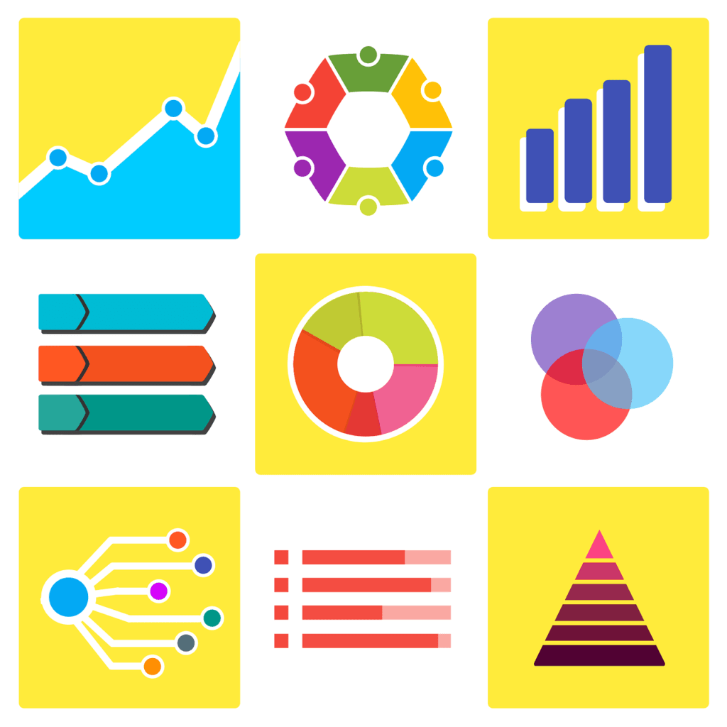
- Visual Learning: Humans are inherently visual creatures. Studies have shown that people retain information better when presented visually rather than textually. Infographics, with their blend of graphics and succinct text, cater precisely to this preference.
- Complex Simplification: Financial topics can be labyrinthine. Whether it’s explaining tax brackets, investment strategies, or the implications of interest rates, infographics distill complex subjects into easily understandable visuals.
- Shareability: In the age of social media, content that is shareable reigns supreme. A well-designed infographic can quickly go viral, spreading awareness and potentially driving traffic back to the source.
Enhancing Cognitive Comprehension
Facilitating Faster Information Processing
The human brain processes visual information 60,000 times faster than text, a statistic of paramount importance in the financial world where time is often of the essence. Infographics capitalize on this by presenting data and concepts in a way that can be quickly understood, enabling viewers to grasp complex financial information at a glance. For startups, incorporating data visualization techniques that highlight key information can significantly enhance the viewer’s comprehension and retention.
Reducing Cognitive Load
Financial information can be dense and overwhelming. Infographics help in breaking down these large chunks of data into manageable visuals, reducing the cognitive load on the viewer. By presenting information through charts, graphs, and bullet points, startups can make the learning process more intuitive, encouraging deeper engagement with the content.
Building Brand Authority and Trust
Showcasing Expertise through Detailed Visual Analysis
Infographics not only inform but also demonstrate a brand’s expertise and authority in the financial domain. A well-crafted infographic citing up-to-date research and trends showcases your startup’s depth of knowledge and commitment to providing value. This, in turn, builds trust with your audience, positioning your brand as a reliable source of financial insight.
Enhancing Brand Recognition with Visual Elements
The consistent use of brand elements such as colors, logos, and fonts in infographics helps in reinforcing brand identity. Over time, these visual cues can enhance brand recognition, making your startup’s financial content stand out in a crowded marketplace. Additionally, the shareable nature of infographics can increase brand exposure across various platforms, amplifying your reach and influence.
Maximizing Engagement and Conversion
Leveraging Visual Storytelling to Spark Interest
Infographics are not just tools for presentation but also powerful storytelling mediums. By weaving financial data into compelling narratives, startups can captivate their audience, making the information more relatable and engaging. This storytelling approach can spark interest in your offerings, driving conversions and fostering a loyal audience.
Encouraging Social Shares and Backlinks
The visually appealing and easily digestible format of infographics encourages viewers to share them on social media and other platforms, increasing your content’s reach and engagement. Additionally, infographics can generate backlinks when other sites use them as a reference, boosting your site’s SEO and driving more organic traffic.
Strategic Considerations for Financial Infographics
Tailoring Content to Target Audiences
Understanding your target audience is crucial in creating effective infographics. Startups should conduct thorough market research to identify their audience’s financial interests, challenges, and preferred content formats. This insight allows for the customization of infographics to meet the specific needs and preferences of different segments, enhancing relevance and engagement.
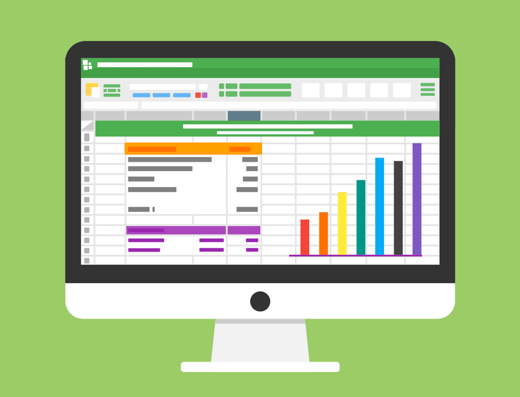
Utilizing Data Visualization Best Practices
Effective data visualization is key to creating impactful infographics. This includes using clear labels, appropriate graph types, and highlighting key findings. Startups should focus on clarity and simplicity to convey their message effectively, avoiding overly complex designs that can confuse the audience.
Leveraging Infographics for Strategic Advantage
In the complex and often intimidating world of finance, infographics offer a strategic advantage by making information accessible, engaging, and memorable. For startups, the thoughtful integration of infographics into their content strategy can elevate their brand, build authority, and drive engagement. By adhering to best practices in design and data visualization, and aligning content with audience needs, startups can harness the power of infographics to simplify the financial world for their audience, one visual at a time.
Crafting Financial Infographics: Key Principles
- User-Centric Design: Before creating an infographic, consider the target audience. What do they know? What do they need to know? Tailor your design and content accordingly. For instance, an infographic for novice investors would differ vastly from one for seasoned traders.
- Limit Information Overload: While it’s tempting to cram as much information as possible into one visual, this can be counterproductive. Stick to one primary topic per infographic, ensuring clarity and focus.
- Quality over Quantity: A well-researched, beautifully designed infographic will always outperform a rushed, cluttered one. Invest time in sourcing accurate data and creating engaging visuals.
Aligning Design with Financial Narratives
Narrating Visual Stories with Data
Financial data, when presented without context, can be dry and difficult to digest. Transforming this data into a narrative not only makes your infographic more engaging but also more memorable. Start with a clear introduction, present the data in a logical sequence, and conclude with a compelling summary or call to action. Utilize visual cues such as arrows or pathways to guide the viewer through the story, ensuring a cohesive and intuitive flow of information.
Highlighting Key Insights with Design Elements
Use design elements strategically to draw attention to key insights or data points within your infographic. Techniques such as contrasting colors, icons, or spotlight effects can emphasize important information, making sure viewers don’t miss the core messages. This focused approach helps convey the most valuable insights derived from complex financial data.
Optimizing for Clarity and Accessibility
Simplifying Complex Concepts
The primary goal of a financial infographic is to simplify complex concepts, making them accessible to a broader audience. This means breaking down jargon into layman’s terms and using visuals to explain concepts that words alone might not adequately convey. For example, complex investment strategies can be illustrated through step-by-step flowcharts, while the effects of market trends on investments can be visualized with comparative graphs.
Ensuring Readability Across Devices
With the increasing consumption of content across various devices, ensuring your infographic is legible and engaging on everything from a desktop to a smartphone is essential. This might mean creating different versions of the same infographic tailored to different screen sizes or ensuring that the most critical information is visible and clear, even on smaller screens. Testing your designs across devices before finalizing them can prevent readability issues and ensure a wider reach.
Leveraging Data Integrity and Accuracy
Citing Credible Sources
Financial information requires the highest level of accuracy and credibility. Ensure that all data presented in your infographic is sourced from reputable and reliable sources, and always provide clear citations. This not only bolsters the trustworthiness of your infographic but also positions your startup as a credible authority in the financial sector.
Updating Content to Reflect Changes
The financial world is dynamic, with frequent changes in data, regulations, and market conditions. Regularly review and update your infographics to ensure they reflect the most current information. This commitment to accuracy not only serves your audience’s needs but also reinforces your brand’s reputation for reliability and trustworthiness.
Engaging and Action-Oriented Design
Incorporating Interactive Elements
Where possible, incorporate interactive elements into your infographics. Interactive charts, clickable sections that reveal more information, or short quizzes can transform a static infographic into an engaging experience. These elements not only make the learning process more enjoyable but also encourage viewers to spend more time with your content, increasing engagement and retention.
Encouraging Social Sharing and Engagement
Design your infographics with social sharing in mind. Include easily shareable quotes, compelling statistics, or eye-catching visuals that viewers are likely to share on their social networks. Also, provide clear calls to action within your infographic, whether it’s inviting viewers to learn more on your website, sign up for a newsletter, or follow your startup on social media. This not only extends the reach of your content but also drives direct engagement with your brand.
Mastering the Craft for Maximum Impact
For startups in the financial sector, infographics represent a powerful tool for distilling complex information into engaging, accessible content. By adhering to these expanded principles—aligning design with narratives, optimizing for clarity and accessibility, ensuring data integrity, and focusing on engagement—startups can create financial infographics that not only capture attention but also educate and inspire action. This strategic approach to infographic design and content creation can significantly enhance a startup’s visibility, authority, and engagement in the competitive financial landscape.
SEO Strategies for Financial Infographics
- Optimize Image File Names: Search engines can’t “see” images in the way humans do. When naming your infographic file, use descriptive keywords. For instance, instead of “image1.png,” name it “mutual-fund-investment-breakdown.png.”
- Use Alt Text: Alt text is a brief description of your infographic, helping search engines understand its content. This is essential for image search optimization.
- Embed Code: Offer an embed code below your infographic. This allows others to easily share your content on their platforms, resulting in backlinks and increased visibility.
- Create Accompanying Text: While the infographic should stand alone in terms of content, having an accompanying textual breakdown or summary can boost SEO. This text should be keyword-optimized and provide context to the visual.
Strategic Keyword Integration
Conducting In-depth Keyword Research
Begin with a comprehensive analysis to identify not just high-volume keywords but also long-tail phrases that reflect the specific financial concepts your infographic addresses. Tools like Google’s Keyword Planner, Ahrefs, or SEMrush can provide insights into the search queries your target audience uses, as well as the competitiveness of these keywords. Integrating these keywords into your infographic’s title, description, and accompanying text content can significantly improve its searchability.
Balancing Keyword Use with Natural Language
While keywords are critical, their integration must be natural and contextually relevant. Overuse or forced insertion of keywords can detract from the user experience and potentially harm your SEO performance. Aim for a balance that enhances readability and user engagement, leveraging semantic variations to broaden your content’s reach without compromising its quality.
Enhancing Discoverability with Structured Data Markup
Implementing Schema Markup
Use schema markup to provide search engines with explicit context about the content of your infographic. This structured data helps search engines understand not just what your content is about, but how it should be indexed and displayed in search results. For financial infographics, relevant schema categories might include “Article,” “ImageObject,” or “EducationalContent.” Implementing this markup can improve the chances of your infographic being featured in rich snippets or knowledge graphs, significantly boosting visibility.
Building a Content Ecosystem Around Your Infographic
Creating Complementary Content
Enhance the SEO value of your infographic by building a robust content ecosystem around it. This includes detailed blog posts that expand on the infographic’s topics, how-to guides that delve deeper into specific financial strategies illustrated in the infographic, and FAQ pages that address common questions related to the content. Linking these pieces of content to each other not only enriches the user experience but also strengthens the internal link structure of your site, a positive signal for search engines.
Leveraging Guest Posting for Backlinks
Reach out to reputable financial blogs, news outlets, and industry websites with an offer to guest post or provide your infographic as a valuable resource for their audience. This strategy can result in high-quality backlinks to your infographic, enhancing its authority and search engine ranking. When selecting partners for guest posting, prioritize sites with high domain authority in the financial sector to maximize the SEO benefits.
Optimizing for Mobile and Page Speed
Mobile Responsiveness and Loading Speed
Given the increasing predominance of mobile browsing, ensuring your infographic is fully optimized for mobile devices is crucial. This includes responsive design that adapts to various screen sizes and layouts, as well as image compression techniques to minimize loading times without sacrificing quality. Google’s Mobile-Friendly Test and PageSpeed Insights can provide actionable recommendations to enhance mobile responsiveness and speed, critical factors in both user experience and search engine ranking.
Monitoring Performance and Adjusting Strategy
Utilizing Analytics for Continuous Improvement
Track the performance of your infographic using tools like Google Analytics to monitor metrics such as page views, bounce rates, and conversion rates. Analyzing user behavior can offer insights into how effectively your infographic is attracting and engaging viewers, as well as how it’s contributing to your overall marketing goals. Use this data to refine your SEO strategies, identify opportunities for content updates or improvements, and better align your efforts with user needs and search trends.
A Comprehensive Approach to SEO for Financial Infographics
For startups in the financial sector, infographics offer a compelling medium to simplify and communicate complex information. However, creating impactful infographics is just the beginning. By implementing these advanced SEO strategies, you can ensure your financial infographics not only reach a wider audience but also engage and inform effectively. Through strategic keyword integration, discoverability enhancements, a supportive content ecosystem, and continuous performance monitoring, your infographics can serve as powerful tools to enhance your online presence and authority in the financial space.
Mobile Optimization for Infographics

The rise of mobile usage means that a significant portion of your audience will view your infographic on a smaller screen. Here’s how to ensure your infographic is mobile-friendly:
- Responsive Design: Ensure your infographic scales and adjusts to different screen sizes. This may require a dynamic design that reconfigures the infographic layout based on the viewer’s device.
- Fast Loading Times: Large image files can slow down page loading times, especially on mobile. Optimize the image size without compromising quality. Tools like TinyPNG or Compressor.io can help reduce file sizes without degrading visual fidelity.
- Vertical Layout: Given the scroll nature of mobile devices, vertical infographics often perform better than horizontal ones. They allow users to easily scroll through the information sequentially.
Designing for Mobile First
Adopting a Mobile-First Design Philosophy
When creating financial infographics, adopt a mobile-first design approach. This means designing with the limitations and advantages of mobile devices in mind from the outset, rather than treating mobile optimization as an afterthought. Focus on simplifying designs to ensure core messages and data are easily digestible on smaller screens. This approach not only enhances the user experience on mobile devices but also aligns with Google’s mobile-first indexing, improving your infographic’s search engine visibility.
Utilizing Scalable Vector Graphics (SVGs)
For financial infographics, where clarity and detail are paramount, consider using SVGs for your graphics and icons. Unlike raster images, SVGs scale without losing quality, ensuring your infographics remain crisp and clear on any screen size. SVGs also typically have smaller file sizes compared to high-resolution raster images, contributing to faster loading times on mobile devices.
Enhancing User Interaction on Mobile
Simplifying Navigation
Mobile users navigate content differently than desktop users, often relying on scroll and swipe gestures. Design your infographics with vertical layouts that facilitate easy scrolling and segment information into clear, concise sections. This ensures users can navigate through the infographic without zooming or excessive scrolling, enhancing engagement and retention.
Incorporating Touch-Friendly Elements
Ensure all interactive elements, like buttons or links within your infographic, are touch-friendly. This means making them large enough to be easily tapped with a finger and spaced adequately to prevent accidental taps. Touch-friendly design not only improves usability but also contributes to a positive user experience, encouraging further interaction with your content.
Optimizing Load Times for Mobile Users
Compressing Images Without Sacrificing Quality
Image file size can significantly impact page load times, particularly on mobile devices with slower internet connections. Use tools to compress your infographic images, reducing file size without compromising visual quality. Optimal compression balances clarity and detail with the need for speed, ensuring your infographics load quickly on mobile devices, thereby reducing bounce rates.
Implementing Lazy Loading
Lazy loading is a technique where images only load when they enter the viewport of the browser. Implementing lazy loading for your infographics means that users won’t have to wait for the entire graphic to load before starting to engage with the content. This can significantly improve page load times and user experience on mobile devices, where bandwidth and processing power may be limited.
Leveraging Mobile Analytics for Continuous Improvement
Analyzing Mobile User Behavior
Use mobile-specific analytics to gain insights into how users interact with your infographics on mobile devices. Metrics such as mobile bounce rate, time on page, and scroll depth can provide valuable feedback on the effectiveness of your mobile optimization strategies. Continuously monitoring these metrics allows you to identify areas for improvement, tailoring your content to better meet the needs and preferences of your mobile audience.
A/B Testing for Mobile Optimization
Conduct A/B testing on different mobile design elements of your infographics, such as layout, navigation buttons, and call-to-action placements. This empirical approach helps identify the most effective design choices, optimizing user engagement and conversion rates on mobile devices.
Prioritizing Mobile Optimization
For financial startups looking to leverage infographics effectively, prioritizing mobile optimization is a strategic imperative. By designing for mobile first, enhancing user interaction, optimizing load times, and leveraging mobile analytics, startups can ensure their financial infographics resonate with the growing mobile audience. This not only improves user engagement and content shareability but also bolsters overall SEO performance, driving visibility and engagement in the competitive financial landscape.

Related: Check out our free SEO suite

Promoting Your Financial Infographics
- Leverage Social Media: Platforms like Pinterest, Instagram, and LinkedIn are ideal for sharing infographics. Customize your infographic dimensions for each platform for optimal viewing.
- Guest Posting: Reach out to financial blogs or websites that might be interested in featuring your infographic. This not only gets you visibility but also potential backlinks.
- Email Newsletters: If you have an email subscriber list, use it. Sharing your latest infographics via newsletters can drive traffic and engagement.
Leveraging Multi-Channel Distribution
Strategic Social Media Sharing
While sharing on platforms like Pinterest, Instagram, and LinkedIn is a good start, a more strategic approach can amplify your results. Tailor your social media posts to the specific platform and audience. For example, use LinkedIn for professional and industry-related shares, while Instagram can showcase the visual aspect of your infographic with engaging captions. Consider the timing of your posts, targeting peak activity times for your audience, and don’t shy away from reposting your content periodically to capture different time zones and increase visibility.
Utilizing Email Marketing
Email marketing remains a powerful tool for direct engagement. Segment your email list based on user interests and financial knowledge levels to ensure that recipients find your infographics relevant and valuable. Incorporate a compelling call-to-action in your email campaigns, encouraging recipients to view the full infographic on your website and share it with their networks. Personalization can significantly increase open rates and engagement, turning your email list into a loyal audience base.
Engaging with Influencers and Thought Leaders
Partnering with Financial Influencers
Reach out to influencers within the financial sector who share your target audience. A single share or mention from a trusted influencer can significantly extend your infographic’s reach and credibility. Provide influencers with a brief and valuable summary of your infographic’s key points, making it easy for them to share or reference it in their content.
Collaborating with Industry Thought Leaders
Engage thought leaders by offering to co-create infographics or inviting them to provide quotes or insights for your graphics. This collaboration not only enriches your content but also leverages the thought leader’s audience when they share the final product. Ensure that the partnership is mutually beneficial, providing value to the thought leader’s audience while enhancing your content’s authority and reach.
Maximizing SEO Through Guest Posting and Syndication
Guest Posting on Financial Blogs and Websites
Identify reputable financial blogs and websites that accept guest posts or are open to content collaboration. Offer high-quality, original articles or blog posts that incorporate or complement your infographic. This strategy can drive targeted traffic to your site, improve backlink quality, and increase your infographic’s visibility among interested audiences.
Syndicating Your Content
Content syndication on financial news sites or platforms can also boost visibility. Ensure that syndicated posts link back to your original infographic, driving traffic to your site and improving your SEO through quality backlinks. Always choose syndication partners wisely, focusing on those with audiences that align with your target demographic.
Utilizing Paid Promotion Strategies
Exploring Paid Social Media Advertising
For infographics targeting specific financial topics or niches, paid social media advertising can offer precise targeting options, including demographics, interests, and behaviors. Use engaging visuals and compelling copy to create ads that direct users to your infographic. A/B test different ad creatives and targeting criteria to optimize campaign performance and ROI.
Leveraging Google Ads
Consider using Google Ads to promote your infographic based on targeted keywords related to financial concepts. This can be particularly effective for timely or trending financial topics where organic search competition is high. Use ad extensions to make your ads more appealing and informative, and optimize landing pages to ensure a seamless user experience for those clicking through.
A Strategic Promotion Plan
Promoting financial infographics requires a multifaceted approach, combining organic, earned, and paid strategies to maximize reach and engagement. By leveraging multi-channel distribution, engaging with influencers and thought leaders, maximizing SEO through guest posting and syndication, and utilizing paid promotion strategies, startups can ensure their financial infographics not only reach but also resonate with their intended audience. This strategic promotion plan, underpinned by high-quality, valuable content, can significantly enhance your startup’s visibility, authority, and engagement in the financial sector.
Measuring the Success of Your Infographics

Like all content marketing efforts, it’s vital to measure the success of your infographics to understand what’s working and what’s not:
- Engagement Metrics: Track likes, shares, and comments on social media. These will give you a sense of how resonant and shareable your infographic is.
- Website Analytics: Use tools like Google Analytics to measure the traffic driven by your infographic. Look for metrics like page views, bounce rate, and the average time spent on the page.
- Backlinks: Monitor how many websites or blogs are linking back to your infographic. This not only boosts SEO but also indicates the perceived value of your content in the broader financial community.
Establishing Key Performance Indicators (KPIs)
Defining Clear Objectives and Corresponding KPIs
Before launching an infographic, clearly define what success looks like. Is it brand awareness, lead generation, or user education? Establishing clear objectives allows you to identify corresponding KPIs, such as social shares for awareness, lead form submissions for conversion, or time spent on page for engagement. This alignment ensures that you’re not just collecting data, but gathering insights that are meaningful and actionable.
Customizing KPIs for Financial Content
Financial content may have unique objectives, such as increasing financial literacy among a target demographic or promoting a specific financial service. Tailor your KPIs to reflect these specialized goals, possibly measuring webinar sign-ups post-infographic viewing or tracking the use of financial calculators linked within informational content.
Leveraging Analytics Tools for In-depth Analysis
Utilizing Web Analytics Platforms
Tools like Google Analytics offer a wealth of data on how users interact with your infographics. Beyond basic metrics like page views and bounce rate, delve into more nuanced analytics such as user flow to understand how visitors navigate from your infographic to other parts of your site, or goal completions to track specific actions taken after viewing the infographic.
Social Media Analytics for Engagement Insights
Each social platform provides its own set of analytics, offering insights into how your infographics perform in terms of reach, engagement, and shares. Monitor these platforms to understand which types of financial infographics resonate best with your audience and why. This can inform not only the content of future infographics but also the best platforms and formats for distribution.
Conducting Audience Feedback Surveys
Directly Measuring User Perception and Value
While analytics can tell you what actions users are taking, surveys can provide insights into why they’re taking them. Use short, targeted surveys distributed via email or social media to gather feedback on your infographics directly from your audience. Ask about clarity, usefulness, and what topics they’d like to see covered in future infographics.
Benchmarking Against Industry Standards
Comparing Performance with Competitors
Understanding how your infographics perform relative to competitors can provide valuable context for your KPIs. Use tools like BuzzSumo to analyze the social shares of similar financial infographics or Ahrefs to assess backlinks and SEO performance. This benchmarking can highlight areas of strength and opportunities for improvement.
Iterative Improvement Based on Data
Adapting Strategies Based on Performance Analysis
Use the insights gathered from your KPIs, analytics, surveys, and industry benchmarking to refine your infographic strategy. Identify patterns in what works (e.g., topics, formats, distribution channels) and apply these lessons to future infographics. This process of continuous improvement helps optimize your content strategy for engagement, relevance, and impact.
A Strategic Approach to Success Measurement
Measuring the success of financial infographics goes beyond tracking views and likes. By establishing clear objectives and KPIs, leveraging advanced analytics tools, gathering direct audience feedback, and benchmarking against industry standards, startups can gain a deep understanding of their content’s performance. This strategic approach enables not just measurement, but meaningful improvement—ensuring that each infographic you produce is more effective than the last, driving your financial brand forward in a crowded digital landscape.
Future Trends: Infographics and Beyond
As technology evolves, so do content delivery methods. While infographics are currently in vogue, there are emerging trends worth watching:
- Interactive Infographics: These are dynamic visuals where users can click on certain elements to get more information or view different data sets.
- Video Infographics: With platforms like YouTube and TikTok dominating the online space, transforming your infographic into a short, animated video could capture a larger audience.
- Virtual Reality (VR) & Augmented Reality (AR) Infographics: As VR and AR technologies become more mainstream, there’s potential to create immersive infographic experiences. Imagine a 3D infographic on global financial markets where users can “walk” through data points!
The Rise of Interactive and Dynamic Infographics
Embracing Interactivity
Interactive infographics, which allow users to click, scroll, or hover to uncover more detailed information, represent the next step in engaging audiences with complex data. Startups should consider how elements like interactive charts, timelines, or calculators can be integrated into their infographics to provide a more engaging and personalized experience. Tools like Adobe Animate or HTML5 can be used to create these dynamic visuals, enhancing user engagement and providing deeper insights in an interactive format.
Personalization Through Data
With advancements in web technologies, personalized infographics, which adapt content based on the user’s previous interactions or demographic data, are becoming increasingly feasible. For financial startups, this could mean presenting customized investment advice, savings plans, or market analysis based on the user’s specific interests and financial goals. Leveraging user data to create these tailored experiences can significantly boost engagement and user value.
Leveraging New Platforms for Distribution
Expanding Beyond Traditional Social Media
While platforms like Pinterest, Instagram, and LinkedIn remain valuable for infographic distribution, emerging platforms and technologies offer new opportunities for reach and engagement. Consider distributing infographics through platforms like TikTok or Snapchat using short, engaging video clips or exploring augmented reality (AR) platforms where users can interact with your financial data in a completely immersive environment. Staying open to new platforms can help you reach wider and more diverse audiences.
Incorporating Infographics into Email Marketing
Innovative email marketing techniques, such as embedding interactive elements directly within emails, can revitalize your email campaigns with engaging content. For financial infographics, consider including key highlights or interactive charts within the email body, encouraging recipients to engage directly from their inbox. This approach can drive higher engagement rates and direct traffic to your full infographic hosted on your site.
Predictive Analytics for Content Strategy
Anticipating Audience Needs
Emerging technologies in predictive analytics and AI can analyze past user interactions to forecast future content preferences and trends. For financial startups, utilizing these technologies to anticipate topics of interest, market concerns, or investment trends can guide the creation of infographics that address upcoming audience needs and questions before they become mainstream. This forward-thinking approach ensures your content remains relevant and engaging.
Investing in Visual and Technological Literacy
Building Skills in Emerging Technologies
As the complexity and capabilities of visual content continue to grow, investing in the skills and tools needed to create advanced infographics is essential. Encourage your team to explore courses in data visualization, interactive design, and emerging web technologies. Building expertise in these areas can empower your startup to lead in the creation of innovative financial content.
Conclusion: Navigating the Future of Financial Content
The future of infographics in the financial sector is bright, with opportunities to engage audiences through interactivity, personalization, and the use of emerging platforms and technologies. By staying attuned to these trends and investing in the necessary skills and tools, startups can not only adapt to the changing digital landscape but also set new standards for engaging and informative financial content. As you navigate these developments, remember that the goal remains the same: to simplify complex information and make financial concepts accessible and engaging for all.
Conclusion: The Confluence of Art, Finance, and SEO
At its core, an infographic is a fusion of design aesthetics and factual precision, presenting information in a manner that is both delightful and instructive. When merged with the power of SEO, it can transcend mere aesthetics to become a potent tool for education, awareness, and engagement in the financial sector.
Financial infographics, armed with SEO strategies, have the potential to demystify complex topics, fostering a more informed audience. As technology and digital trends evolve, so will the methods to optimize and disseminate these visual masterpieces. Staying updated with these trends, coupled with an unwavering commitment to quality and authenticity, will ensure that your infographics remain relevant, impactful, and always in demand.
Whether you’re a financial institution, a budding entrepreneur, or someone keen to share knowledge, harnessing the dual power of infographics and SEO can pave the way for greater visibility, engagement, and understanding in the ever-evolving world of finance.
Read next:


Comments are closed.