WinSavvy Editorial Standards
How this article was created
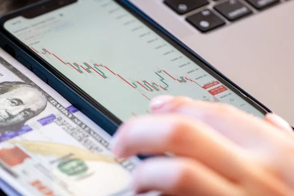
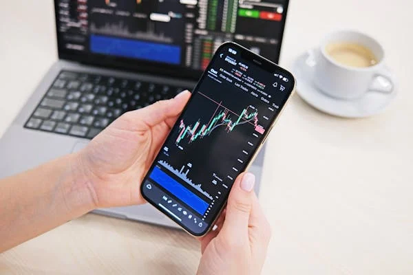
Getting someone to click “buy now” isn’t just about having a good product. It’s also about how you present your price. This is where psychological pricing comes in. Small tweaks in how you display a number can dramatically change what customers do next. And we’re not guessing here. The strategies in this article are all backed by data.
1. Charm pricing (e.g., $9.99) increases sales by an average of 24% compared to rounded pricing
Why just a penny makes a big difference
Charm pricing plays with how our brains read numbers. When we see $9.99, we mentally round it down to $9, even though it’s just one cent less than $10. This tiny shift tricks the brain into seeing it as a better deal.
Researchers found that charm pricing increases sales by about 24%. That’s a big boost for just changing the last digit. What’s really happening here is psychological framing. That 9 triggers a feeling of value, and customers feel like they’re saving money.
How to apply this in your pricing
Use charm pricing on product pages, subscription plans, or any kind of ecommerce setting. Instead of $20, try $19.99. Instead of $50, try $49.95.
If you’re selling services, charm pricing still works. A consulting session priced at $149 looks more appealing than $150. For digital goods, eBooks, or SaaS tools, try pricing your tiers like $9.99, $29.99, and $59.99.
However, charm pricing works better for everyday items and mid-range products. If you’re selling something high-end or luxury, rounded numbers might work better—and we’ll cover that later.
Make sure to test. A/B testing two versions of your price (e.g., $99.99 vs. $100) can help you know what works for your specific audience.
2. Prices ending in ‘9’ can boost conversion rates by up to 40%
The power of the number 9
The number 9 isn’t just lucky in pricing—it’s a powerhouse. A study by MIT and the University of Chicago showed that products priced at $39 outperformed those priced at $34 and even $44. That’s right—people chose the more expensive $39 product simply because it ended in 9.
That’s not about logic. It’s about psychology. That 9 signals a deal. Our brains read $39 as closer to $30 than to $40, which makes it feel like a lower price—even though it’s not.
When to use prices ending in 9
Use 9s in retail pricing, landing pages, and promotional offers. If you’re running an ad campaign, ending the price in 9 can significantly lift conversions.
SaaS companies can use it on monthly and yearly plans. So instead of pricing at $100/month, go with $99. The 9 ending works best when you’re selling to price-sensitive audiences.
Avoid using 9s if you’re selling to premium or business-to-business markets where precision and quality matter more than the deal. For those cases, whole numbers work better.
If you’re already using charm pricing, try pairing it with this strategy by having all prices end in 9. It adds consistency to your pricing structure and makes it feel intentional.
3. Consumers perceive prices with fewer syllables (e.g., $1,499 vs. $1,500) as significantly cheaper
How price sounds matters more than you think
Here’s something surprising: we don’t just read prices—we “hear” them in our heads. A price with fewer syllables sounds shorter and, in turn, feels cheaper. $1,499 has five syllables. $1,500 has six. That small difference matters.
In one study, people consistently said that $1,499 sounded like a better deal than $1,500—even when they weren’t speaking the price out loud. It’s because we process numbers both visually and verbally.
Tactics to use this insight in your pricing
When you write your prices, try picking numbers with fewer syllables. For example, $2,497 is read faster than $2,500. It feels like less effort and less money. This works well in sales pages, checkout screens, or anywhere the buyer is making a decision.
You can even use this for upsell offers. Instead of pricing an add-on at $299, go with $297. It’s shorter to say, shorter to read, and feels smaller—without changing your profit margin by much.
In ad copy or verbal pitches, this becomes even more important. Practice saying your price aloud. Does it sound clunky or smooth? Streamline where you can.
The key takeaway: don’t just look at your numbers—listen to them.
4. Anchor pricing boosts perceived value, increasing sales by up to 26%
Set the stage with a higher price first
Anchoring is the idea that the first number people see becomes their reference point. If you show a $200 product next to a $99 product, the $99 one feels like a deal—even if $99 was your original goal.
In one experiment, adding a higher “anchor” price increased sales by 26%. That anchor doesn’t need to be real—it just needs to be visible. When buyers compare, they adjust their expectations.
How to use price anchoring for your offer
Start by creating a visible price contrast. Show your most expensive option first. If you offer three pricing plans, list the premium one at the top. This makes the other two feel cheaper in comparison.
You can also show a “was” price. Display the original price next to the new one, even if it was only the launch price. “Was $199, now $129” anchors buyers to the higher value and creates urgency.
If you’re pitching services, include a comparison chart. Show what competitors charge, even if you’re not naming names. This sets a higher mental benchmark for your pricing.
You can also anchor against time. For example: “Normally $100/hour—now $60/hour if you book today.” This makes $60 feel like a steal.
The takeaway is simple: people don’t know what something is worth until you show them what it could have cost.
5. Bundling can increase average order value by 30%
Why bundles work so well
People love to feel like they’re getting a deal. Bundling takes advantage of this. When you combine multiple items into a single offer and give it one price, it creates the impression of value. Even if the total price isn’t a huge discount, the perception is that they’re saving money.
This effect isn’t small. Studies show bundling can increase average order value by 30%. It works because it reduces the pain of paying for each item individually. Instead of mentally calculating each cost, the buyer sees one total, which makes it easier to say yes.
How to use bundling in your business
Start by identifying products or services that make sense together. For ecommerce, this could be related products—a main item plus accessories. For digital products, it might be a set of courses or tools. For services, offer a package: consultation, follow-up, and report all in one.
Price the bundle slightly below the combined value. If the total value is $300, offer it at $249. But don’t go too low. The goal is to increase perceived value and revenue—not to discount too heavily.
Use clear language to explain the savings. Phrases like “Get all three for the price of two” work well. Also, show the individual prices alongside the bundle to make the savings visible.
Finally, create urgency by limiting how long the bundle is available. This can give hesitant buyers a reason to act now.
6. Displaying a higher original price next to a discounted price increases perceived value by 53%
Discounts feel bigger when you show the before and after
When you show a higher original price next to a discounted price, you create instant contrast. It tells the buyer, “Look how much you’re saving.” This isn’t just common sense—it’s backed by research. Displaying the old price alongside the new one increases perceived value by 53%.
That’s because people anchor on the first price they see. If the first price is high, the new price feels like a win—even if it’s still high.
How to frame your discounts
Always show both the original price and the current price. Don’t just say “20% off.” Write it like this: “Was $150, now $99.” The exact numbers hit harder than percentages alone.
Use visual cues. Strike through the original price or make it a lighter font. Then highlight the new price. This helps the lower price stand out.
In your copy, explain the reason for the discount. It could be a seasonal sale, an anniversary offer, or a limited promotion. Giving a reason adds legitimacy and urgency.
Avoid overusing this tactic. If every product always shows a discount, buyers may become suspicious. Use it strategically for special offers or to boost underperforming items.
If you offer services, apply the same tactic by showing standard rates and limited-time offers side by side. This makes your current offer more attractive.
7. Prestige pricing (e.g., using whole numbers like $100) increases perceived product quality by 38%
Whole numbers signal luxury
Prestige pricing means using rounded, clean prices like $50 or $100. Unlike charm pricing, which makes products feel like a bargain, prestige pricing makes them feel premium. Research shows that whole numbers can increase the perceived quality of a product by 38%.
This is especially effective in categories where trust, quality, or luxury matter more than saving a few cents.
When to use prestige pricing
Use it when you’re selling premium products or services. If you’re positioning yourself as high-end, pricing your offer at $200 instead of $199.99 actually works better.
It’s also a good fit for consulting, coaching, and other expert services. Rounded pricing feels intentional, professional, and confident. Saying your rate is $2,000 communicates more authority than $1,997.
Prestige pricing is also easier to remember. That makes it great for brand recall and repeat purchases.
If you’re running multiple pricing tiers, use prestige pricing on your highest package. It helps differentiate your premium offer from the rest and justifies the higher value.
To strengthen the effect, pair the pricing with clean design and simple messaging. Avoid clutter, gimmicks, or loud colors. Keep it sleek and focused—just like the price.
8. Relative pricing comparison increases decision likelihood by 30%
People decide faster when they can compare
Pricing doesn’t exist in a vacuum. Customers need something to compare your price to. If you only give one option, they might hesitate or leave to shop around. But when you show a relative comparison—like two or three pricing plans—decision-making increases by 30%.
That’s because people need a frame of reference. A solo price feels risky. But a set of options gives the buyer confidence they’re picking the right one.
How to use comparison in your pricing
Offer pricing tiers. Show two or three packages side by side—basic, standard, and premium. Highlight the one you want them to choose (usually the middle).
Be sure the difference between tiers is clear. Don’t just change the price—change the features too. Make sure each plan feels like it belongs at its price point.
You can also compare your price to others in the market. Say something like, “Most competitors charge $1,000. Our price: $699.” This helps customers understand your value.
Even better: use comparison charts. Show side-by-side features and prices. Make it easy to scan and compare.
When you help your customer compare, you also help them decide. That’s what moves them from “thinking about it” to buying.
10. Including a ‘decoy’ option in pricing increases premium package purchases by up to 43%
The magic of the middle choice
Sometimes, people don’t want the cheapest option. They want the one that feels like the best value. That’s where a decoy option comes in. A decoy is a pricing tier that makes another option look like a better deal.
For example, let’s say you have:
- Basic: $5
- Premium: $10
- Decoy: $9.50, but with fewer features than Premium
Now, Premium suddenly feels like a smart upgrade. In one study, adding a decoy boosted premium purchases by 43%.
How to create a smart decoy
Design your pricing plans with three tiers. The middle plan should be the one you want to sell most. Then build a decoy that’s priced close to the highest plan but with fewer benefits.
This makes the premium plan look more valuable by comparison. The goal isn’t to sell the decoy—it’s to make another plan more attractive.
You can also use a high-priced decoy to anchor your middle offer. If your Premium plan is $99/month, a $199 decoy (with only a slight upgrade) makes the $99 plan look like a great deal.
Make sure the differences between plans are easy to understand. Use tables or bullet points to show what’s included.
This tactic works especially well for software, subscription services, and any business with tiered pricing.
11. People are 35% more likely to choose a product priced slightly lower than a round number (e.g., $2.99 vs $3.00)
One cent makes a big difference
At first glance, there doesn’t seem to be a major difference between $2.99 and $3.00. But for buyers, that one cent plays a psychological trick. Pricing a product just below a whole number—known as “just-below” pricing—has been proven to boost purchase decisions by about 35%.
Why does this happen? It’s about how we process numbers from left to right. When we see $2.99, the first digit is 2, so we mentally categorize it closer to $2 than $3. That tiny gap makes the price feel noticeably lower.
How to apply this tactic effectively
Use just-below pricing for items in the $1 to $100 range. It’s most effective in this range because buyers pay closer attention to small differences here.
Instead of rounding up, go slightly below a round number. For instance, if you’re selling a digital product at $10, price it at $9.99. If you’re selling a subscription at $50, try $49.99.
This is especially powerful in online stores, SaaS pricing pages, or mobile apps where people are comparing multiple items quickly. That small shift gives your offer a psychological edge.
Keep your pricing consistent. If most of your prices end in 99 or 95, don’t suddenly throw in a clean $100. Consistency signals professionalism and strategy.
And if you ever wonder whether one cent really matters—remember this stat. It’s not just about money. It’s about perception.
12. Color cues like red price tags increase perceived urgency and boost sales by 9%
Colors change how we feel about prices
Our brains don’t process prices in isolation. The colors we see around them shape our reaction too. One powerful example: red.
Using red for prices, especially during promotions, has been shown to increase urgency and improve sales by 9%. Red grabs attention. It signals action, urgency, and excitement. It also taps into common associations—red is the color of clearance tags and sale banners.
How to use color to drive more conversions
In your design, make sure your promotional prices stand out. If your regular price is in black or gray, use red for the sale price. That contrast helps buyers notice the difference instantly.
But be strategic. Red works best for urgency—like limited-time offers, flash sales, or seasonal discounts. Don’t overuse it, or it loses its effect.
For luxury products or premium services, red might feel too aggressive. In those cases, you might use gold, black, or dark blue to convey sophistication instead.
Use color alongside other urgency signals—like countdown timers or “X hours left” badges—to reinforce the message.
And always test your color choices. Sometimes, even a small design tweak—like changing the price font color—can lead to more clicks, more checkouts, and more revenue.
13. Showing the daily equivalent cost (e.g., $1/day) improves subscription conversions by 22%
Break it down to make it feel affordable
One of the most effective ways to present a recurring cost is to break it down into its smallest time unit—usually daily. Instead of saying, “This costs $30/month,” say, “Just $1 a day.”
It’s not a trick—it’s a way of making the cost relatable. People can’t always visualize a monthly budget, but they understand what they spend in a day. This makes your offer feel more affordable and easier to say yes to.
In one study, breaking the cost into a daily rate increased subscription conversions by 22%.
How to use daily breakdowns in your pricing
This tactic is ideal for subscription services, SaaS tools, memberships, and anything billed monthly or yearly. For example, instead of saying your tool is $360/year, say it’s “less than $1/day.”
Make the daily cost the headline, and place the full price below in smaller text. This lets buyers anchor on the small, manageable number first.
Use plain language. Instead of $0.97/day, round it up and say “just $1 a day.” The simplicity makes it more believable.
Daily breakdowns also work in upsell offers. If you’re offering a feature upgrade, show how little it adds per day, even if it adds a bigger chunk per month.
This tactic isn’t just about math—it’s about making your product feel like part of the buyer’s routine, not a big financial decision.
14. Removing the currency symbol (e.g., showing “5” instead of “$5”) can increase purchase rates by 15%
Less money symbols, less payment pain
We associate currency symbols with spending. The second we see a $, £, or €, our brains go into budgeting mode. That’s why removing the symbol altogether—especially in restaurant menus and product displays—has been shown to increase purchase rates by 15%.
It makes the price feel like just a number, not a cost. Without the currency symbol, buyers are less likely to focus on what they’re spending and more on what they’re getting.
How to apply this in your pricing layout
This tactic works best when people are already expecting to pay. For example, on food menus, in-store displays, or product catalogs. If you’re showing multiple options, dropping the $ can soften the pricing across the board.
In digital settings, try testing this on pricing tables or package cards. If your customer is already in the buying mindset, removing the dollar sign might increase clicks on the purchase button.

But use it carefully. Don’t remove the currency symbol on checkout pages. At that point, people want clarity. Ambiguity there can lead to mistrust or drop-off.
You can also make the price look smaller by using light gray text or smaller font sizes for the price symbol, instead of removing it completely.
Remember: it’s not about hiding the cost. It’s about reducing the emotional friction that can stop a buyer from moving forward.
15. When given three pricing tiers, 66% of customers choose the middle option (the Goldilocks effect)
Most people choose what feels “just right”
There’s a classic pattern in human decision-making: we tend to avoid extremes. When given three options, most buyers choose the middle one—not too cheap, not too expensive, but “just right.” This is known as the Goldilocks effect.
In pricing, this plays out consistently. About 66% of buyers pick the mid-tier option when there are three choices. It feels like the safest choice, balancing value and quality.
How to structure your pricing tiers
Create three packages: Basic, Standard, and Premium. The middle one should be your best-selling option—the one with the features most people need.
Design the other two to guide the decision. The Basic plan should feel limited. The Premium one should feel complete but more than most people need.
Position the Standard plan as the smart choice. Use a visual cue like a highlighted background, a tag that says “Most Popular,” or slightly larger formatting to draw attention to it.
Make sure the jump from Basic to Standard adds real value, and the jump to Premium adds even more—but at a steep price increase.
This tactic works for SaaS tools, service packages, digital courses, and even physical products with upgrade options.
If you’ve ever wondered why so many businesses offer three plans, this is why. And now you can do the same—with purpose.
16. Customers perceive odd pricing ($3.47) as more precise and therefore more trustworthy
Precision equals transparency
When a price looks oddly specific—like $3.47 instead of $3.50—buyers often assume there’s a reason behind it. It feels like it’s been carefully calculated rather than arbitrarily assigned. That sense of precision leads to trust.
This isn’t guesswork. Studies show that customers are more likely to believe a price like $3.47 is based on actual cost or fair value, which makes them more comfortable making a purchase.
Odd pricing feels honest. It gives the impression that you’re not trying to round up and make a quick buck, but rather offering exactly what the product is worth.
How to use odd pricing to build credibility
This tactic works especially well for product pages, pricing pitches, and checkout totals. If you sell physical goods or have itemized services, use non-rounded prices like $27.43 or $118.67.
This is also a great option for discounts. Instead of offering “$10 off,” try pricing the result at $39.73—it feels more calculated and less gimmicky.
In B2B or consulting pricing, a quote of $3,970 feels more tailored than $4,000. It suggests you’ve done the math, not just slapped on a clean number.
This strategy works well when paired with transparency. If you can explain why a price is what it is (e.g., “based on hours, materials, or real costs”), it adds to the feeling of fairness.
And if you’re trying to stand out in a competitive market, precise pricing can give you a subtle but powerful edge.
17. Prices with fewer digits (e.g., $1,499 vs. $1,525) are perceived as cheaper and more appealing
The fewer the digits, the lighter the price feels
We read numbers from left to right, and we tend to process them quickly—especially when we’re browsing or comparing. When two prices are close, but one has fewer digits, that price feels simpler and less intimidating.
For example, $1,499 is more appealing than $1,525—even though the difference is just $26. That’s because 1,499 has fewer numerals, and it’s easier for the brain to process. That mental ease leads to higher purchase intent.
It’s about fluency. Simpler prices feel smoother, and smoother feels better.
How to simplify your prices for maximum impact
Review your pricing and look for ways to trim unnecessary digits. If you’re charging $1525, ask yourself if $1499 delivers the same value—and feels better to the customer.
This tactic works well in ecommerce, landing pages, and product catalogs where buyers compare multiple prices quickly.
You can also apply this in subscription pricing. Instead of $47.50/month, try $47. It’s just one fewer digit, but it reads faster and feels cleaner.
This works best when the price is just over a mental threshold. For example, $999 instead of $1,025. You not only reduce digits—you cross into a lower psychological bracket.
Even in B2B services, fewer digits can help in quotes or proposals. The cleaner the price, the less mental resistance.
And if you must use more digits—like in taxes or shipping—try to keep your main offer clean and simplified.
18. “Pay what you want” models increase revenue by 14% when a suggested price is provided
Freedom plus guidance works best
The “pay what you want” model gives control to the customer. And while it may sound risky, it can actually boost revenue—especially when you offer a suggested price.
Studies show that when you combine pricing freedom with a suggested anchor, customers end up paying more than expected. In fact, revenue increases by around 14% compared to when no price is suggested.

Why? People want to be fair. They also want cues. A suggested price gives them a reference point without making them feel pressured.
How to use this model without losing money
Start with low-cost products—like digital downloads, eBooks, or entry-level tools. These are ideal for pay-what-you-want offers because the delivery cost is minimal.
Provide a clear suggested price. Phrase it as “Suggested: $10” or “Most people pay $15.” This sets a reference without imposing a limit.
Use social proof. Mention how much others are paying. For example, “Average payment: $12.” This encourages fairness and nudges people toward the norm.
Make it easy to choose. Use a slider or set buttons ($5, $10, $15, Other) instead of an open field. More structure leads to more conversions.
Test it. If your audience values independence or you’re building community goodwill, this model might outperform traditional pricing.
And remember, this isn’t just about generosity—it’s about trust. When you show trust in your audience, they often return the favor.
19. Using “was $X, now $Y” framing increases purchase intent by 39%
Context changes everything
When buyers see a price on its own, they have nothing to compare it to. But when you show a previous price, the new one feels like a deal—even if it isn’t deeply discounted.
This is why “was/now” pricing works so well. One study found that it boosts purchase intent by 39%. The key here is framing. By showing what the price used to be, you create a sense of urgency and savings.
Even small differences matter. “Was $45, now $39” performs better than just “$39.”
How to frame your offers to boost perceived value
Always show the old price and the current price side-by-side. Strike through the old price and highlight the new one visually.
This tactic works well on product pages, sales pages, and even in ads. Just make sure your discount feels credible. If your product is always “on sale,” people will stop believing the discount is real.
Use this format in email campaigns too. For example: “Was $80—this week only, $59.”
If you’re a service provider, use “regular rate” vs. “limited offer.” Even for consulting or coaching, this helps set the stage for a decision.
Use round numbers for the “was” price and more attractive pricing for the “now” price. For instance, “Was $200, now $179” combines multiple psychological effects in one move.
And always pair this with a reason. Buyers respond better when they understand why the discount exists—even if it’s as simple as a weekend sale.
20. Price tags aligned to the left (vs. center/right) feel cheaper and more rational to consumers
Even layout influences perception
How you position your prices on the page matters more than you think. It’s not just about the number—it’s about how easy it is to process. Research shows that left-aligned prices are perceived as cheaper and more logical than prices aligned to the right or center.
This is because we read from left to right. When a price appears on the left, it feels more natural. It enters the brain faster and creates less friction.
A left-aligned price also feels like it’s anchored at the beginning—where value judgments start.
How to align your prices for better results
If you’re designing a pricing page, align your price to the left edge of the text block or card. Don’t center it. Left alignment gives a sense of order and stability, which helps people feel more comfortable making a decision.
This also applies to menus, catalogs, or proposal documents. Left-aligned pricing feels professional and efficient.
Pair this with concise language. Don’t clutter the area around the price with too many symbols or icons. Let the number do the talking.
This small design tweak may seem minor, but it can improve conversions—especially when buyers are comparing options or deciding quickly.
When you make your prices easier to read and process, you make them easier to accept.
21. Consumers are 20% more likely to buy when prices are displayed in smaller font sizes
Smaller fonts, smaller perceived cost
Visual cues play a strong role in how buyers interpret prices. One of the most overlooked cues is font size. Research shows that when prices are shown in smaller fonts, consumers perceive the amount to be smaller—even when the number itself doesn’t change.
This isn’t about legibility—it’s about perception. A small number in a small font looks less intimidating than the same number in a bold, oversized format. In one study, consumers were 20% more likely to buy when prices were displayed with a modest font size.
It’s a subtle trick that can quietly boost sales.
How to adjust your pricing visuals for impact
Start by testing different font sizes on your sales pages, product listings, or checkout screens. Avoid making your prices the biggest thing on the page. Instead, use a slightly smaller font than your headers or key messaging.
Keep the price legible, but not dominant. It should be clear but understated—this helps it feel lighter.
If you’re combining this with a discount, keep the “was” price in even smaller font or strike-through style. Then present the new price in a small but clean font that blends into the overall layout.

In your design hierarchy, let benefits and value take the spotlight. The price can stay in the background—visible but not screaming for attention.
This tactic works best in digital settings, especially when combined with clear calls-to-action and confidence-building elements like testimonials or guarantees.
22. Time-limited discount banners increase checkout conversion rates by 14%
Urgency plus visibility creates action
A discount alone doesn’t always drive conversions. But when it’s combined with a visible countdown—or a time-limited message—it triggers urgency. People hate missing out, and when they see the clock ticking, they act faster.
Adding a banner with a time-bound message has been shown to increase checkout conversion rates by 14%. This is a simple, low-effort change that can drive immediate results.
It’s not about being pushy. It’s about helping buyers make a decision before they get distracted or lose interest.
How to use time-limited banners the smart way
Place the banner at the top of your page or just above the pricing section. Make it sticky if possible, so it follows users as they scroll.
Use clear, simple language. For example: “Offer ends in 3 hours” or “Save $25—only today.”
Add a live countdown timer for even more urgency. Seeing the seconds tick down creates a real-time nudge that moves buyers off the fence.
Avoid overwhelming the user. Keep the design minimal, and don’t flash or animate too aggressively. The goal is urgency, not panic.
Pair the banner with strong social proof. For instance, right below the timer, include a message like “300+ people claimed this deal today.” This combines scarcity, urgency, and social influence in one area.
These banners work especially well during promotional events, product launches, or seasonal campaigns—but they can also be part of your evergreen strategy if used sparingly.
23. Free shipping is valued by 61% of online shoppers more than a product discount
Shipping costs feel like a penalty
People love free shipping. In fact, for many online shoppers, free delivery is more important than a discount. Studies show that 61% of buyers prefer free shipping over getting a lower product price.
That’s because shipping feels like a tax or hidden fee. Even if the item is cheaper, a $6.99 shipping charge feels like an added burden.
Offering free shipping reframes the buying experience—it feels like a bonus, not an expense.
How to make free shipping work for your business
If you sell physical goods, build your pricing around the shipping offer. For example, instead of charging $20 + $5 shipping, offer “Free Shipping” and price the item at $25.
Set a free shipping threshold to encourage higher order values. For example: “Free shipping on orders over $50.” This not only boosts conversions but increases cart size too.
Make the free shipping message clear on product pages, in your cart, and throughout the checkout flow. Don’t hide it—highlight it.
If you’re not able to offer free shipping on everything, test limited-time promotions: “Free Shipping This Weekend Only.” This adds urgency and boosts clicks.
And if you’re in SaaS or digital products, apply the same principle: eliminate setup fees or onboarding charges. Buyers respond to “no added cost” just as positively as free shipping.
It’s not always about cutting prices. Sometimes, it’s about removing friction.
24. A single price point (e.g., all items $10) increases total transaction value by 18%
Simplicity drives bigger purchases
Complex pricing can slow down buyers. If they have to stop and calculate or compare too many numbers, they hesitate—or walk away. That’s why single-price-point offers are so powerful.
One study found that offering a flat price—like “Everything $10”—boosted total transaction value by 18%. Buyers spent more because they didn’t have to overthink. They just grabbed what they wanted.
Simple pricing removes decision fatigue. When everything costs the same, people focus on what they like, not what they can afford.
How to use single price points in your offers
Try themed campaigns with a flat rate: “All T-shirts $15” or “Any digital download $5.” It’s simple, clear, and effective.
If you sell services or info products, test packages with a flat fee: “Any service, $100 flat.”
This works well in bundles or product categories. For example, create a landing page where every item is priced the same—regardless of original value.

Use this during sales periods. Shoppers love the clarity of “Nothing Over $25” or “Choose Any 3 for $30.”
The key is clarity. Highlight the one price across your page, emails, and checkout. Remove other numbers from the mix to avoid confusion.
Even high-end brands can apply this in creative ways—such as VIP bundles or seasonal collections with a single, rounded rate.
A one-price structure helps people buy faster—and often buy more.
25. Using high-contrast colors for sale prices increases visibility and clicks by up to 20%
Visual contrast makes prices pop
In a crowded layout, prices can disappear into the background. If buyers don’t notice your sale or promotion right away, it might as well not exist.
That’s why high-contrast colors make such a difference. Displaying sale prices in bright or contrasting colors increases their visibility and can lift clicks by up to 20%.
Contrast draws the eye. It signals importance. And in the context of pricing, it says, “Look here—this is different, and probably better.”
How to make your sale prices stand out
Choose a color that sharply contrasts with your main website palette. If your background is white, use red, orange, or bright green for sale prices. If your theme is dark, go with bright white or yellow.
Place the sale price near the original price, but style it in a way that stands out—bolder color, larger size, or a unique font weight.
Use visual markers like badges or corner tags. For example: “SALE” in red next to the price or a color block behind the discount message.
Be consistent across your marketing. Use the same contrast color in emails, ads, and product pages to create a visual language for discounts.
But don’t overdo it. If everything is bright and loud, nothing stands out. Save high contrast for actual sales or time-sensitive promotions.
Design is not just about looking good. It’s about guiding action—and this small change can have a big impact.
26. Prices ending in “.00” increase the likelihood of purchase for luxury goods by 15%
Round prices feel more premium
When it comes to high-end goods, simplicity matters. Buyers aren’t looking for discounts or deals—they’re looking for trust, quality, and confidence. That’s why prices like $100.00 often outperform $99.99 in premium markets. In fact, luxury goods with rounded pricing have been shown to convert 15% more than when charm pricing is used.
Round numbers feel deliberate. They signal strength and certainty. And in luxury, certainty is part of what you’re selling.
How to apply this in premium positioning
If you’re selling luxury products or services, use whole numbers. For instance, a coaching package at $2,000 feels more confident than $1,997. A handbag priced at $300.00 feels more prestigious than $299.99.
Use this tactic for offers that are built on trust, experience, or craftsmanship. This includes consulting, B2B services, interior design, or handmade goods.
In high-ticket funnels, round pricing can even act as a silent brand signal. It says, “We’re not playing the pricing game. We know what this is worth.”
Use clean fonts and minimal design. Let the number stand alone without extra flair. That simplicity adds to the premium feel.
Avoid decimal-heavy numbers in luxury sales. You’re not trying to look precise—you’re trying to look polished. Keep it sleek.
This tactic isn’t about shaving off pennies. It’s about showing confidence in the full value of your offer.
27. Percentage discounts are more effective than flat discounts for prices under $100
Percentages feel bigger on small ticket items
When you’re selling something under $100, showing a percentage off creates a bigger psychological impact than showing the dollar amount. Why? Because percentages look large, even when the savings aren’t.
If you offer 20% off on a $40 product, that feels like a meaningful discount. But if you say “Save $8,” it feels smaller—even though it’s the same amount.
Tests have shown that using percentage-based discounts on items below $100 tends to boost conversions more effectively than flat dollar-off deals.
How to choose between dollars and percentages
If your product or service is under $100, lean toward percentage-off language. Say “20% off today” instead of “Save $10.”
This works especially well in email campaigns, landing pages, and paid ads. Percentages catch the eye and make the deal feel more substantial.
You can still include the dollar value in small text—for example, “20% off (you save $8)”—but lead with the percentage.

For higher-ticket items ($100+), reverse the approach. A $50 discount sounds more impressive than “10% off $500.”
Make your percentage bold and simple. “30% OFF” is stronger than “Take thirty percent off your order.”
This tactic taps into the emotional brain. It’s not about the exact math—it’s about what feels like a bigger deal.
28. Displaying “save $X” increases conversion more than showing a final discounted price
People want to know what they’re saving
Sometimes, buyers don’t care about what the price is—they care about what they’re getting off. Showing “Save $20” connects with the buyer’s need to feel smart, thrifty, and in control.
That’s why “Save $X” messages outperform messages that only show the new price. Studies show that conversion rates rise when savings are clearly presented—even if the price is also visible.
People like to feel like they’re winning. That savings label is their proof.
How to structure your savings message
Use savings as the headline: “Save $30 when you order today.” Then show the actual price right below.
Put the savings in a larger font or brighter color than the final price. This flips the focus from cost to value.
Use this language in product pages, ads, email subject lines, and even SMS promos. It’s a fast, clear message that doesn’t require mental math.
If you’re offering multiple items, use savings comparisons. “Save up to $50 on bundles” gives shoppers a reason to browse more.
Even for services, you can use this: “Save $100 on your first month of coaching.”
Make the benefit clear, immediate, and personal. The easier you make the savings feel, the easier it is for someone to say yes.
29. Price anchoring with a high-end version increases the likelihood of choosing a mid-tier item by 40%
The expensive item isn’t for selling—it’s for framing
Here’s a powerful psychological trick: offer a super expensive version of your product—not to sell it, but to make your other options look better. This is called price anchoring, and it can increase mid-tier purchases by 40%.
When people see a $3,000 version of your offer, the $1,000 version suddenly feels like a bargain—even if they weren’t planning to spend that much.
It works because we compare prices before we make decisions. That’s just how our brains operate.
How to set up anchoring in your pricing
If you have three tiers, make the highest one much more expensive—but give it just a little more value than the mid-tier. You’re not trying to push people to buy it. You’re helping them feel good about choosing the one in the middle.
Example:
- Basic: $199
- Pro: $399 (most popular)
- Elite: $999
The $999 plan sets a high anchor, making the $399 feel safe and smart.
You can also anchor with your own products or industry norms. “Normally $1,500. Get this for $899 today.” That frames your current offer as a deal.
Use visuals to help: layout your pricing table so that the expensive tier is on the left or right, with the preferred one centered and highlighted.
This tactic works best when the difference in value between tiers is obvious—but the jump in price is even more extreme.
Let your top-tier offer do the heavy lifting, even if no one buys it.
30. Displaying product benefits next to pricing increases conversion by 12%
Remind them what they’re paying for
Too often, pricing is shown in isolation. A number, maybe a plan name, and a checkout button. But when you add a short list of product benefits right next to the price, it reinforces why the number is worth it.
Buyers don’t just want to know what it costs. They want to know what they get.
One study found that conversion increased by 12% when benefits were placed right beside the price—not on a separate page or section.
It’s about timing. When people are deciding, remind them of the value.
How to pair pricing with benefits
List three to five key benefits right next to your price. Keep them short, clear, and outcome-focused.
For example:
- $49/month
Includes:
✓ Unlimited projects
✓ Priority support
✓ 1-on-1 onboarding
These aren’t features—they’re value drivers. Make sure each one answers the buyer’s question: “What’s in it for me?”
Use bullet points or icons to make scanning easy. Avoid long text blocks or feature lists. The goal is to add confidence, not clutter.

Test placing benefits above, beside, and below the price. For many brands, the sweet spot is directly under the number.
Also, try combining this tactic with testimonials or trust badges. That triple combo—benefits, price, and proof—can push people over the finish line.
In every pricing experience, your job is simple: make the value louder than the cost.
Conclusion
Pricing is more than a math problem. It’s a communication tool. Every digit, symbol, color, and comparison you show shapes how buyers feel—and what they do next.
What we’ve uncovered in this article isn’t theory. It’s real data from real behavior. Whether it’s charm pricing that boosts sales by 24%, or the Goldilocks effect that makes 66% of buyers choose the middle plan, every one of these 30 tactics is a tested psychological lever.