WinSavvy Editorial Standards
How this article was created
Marketing flyers still work because people still notice things they can hold, scan, share, and remember. A good flyer does not just “look nice.” It makes a person stop for a second. It gives them one clear reason to care. Then it tells them what to do next. That is the whole job. Simple, but not easy.
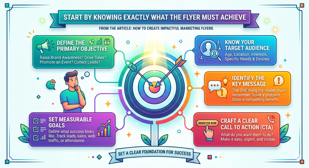
Start by knowing exactly what the flyer must achieve
Before you write a single line or choose a single image, you need to decide what the flyer is supposed to do. This sounds simple, but it is where most weak flyers begin. People often start with design first. They open a template, place the logo at the top, add a few words, and hope the flyer feels right.

That is backwards.
A flyer is not just a small printed page. It is a sales tool. It has a job. That job must be clear before the design begins. If the goal is unclear, the flyer becomes crowded. It tries to promote the business, explain the service, show every benefit, mention every offer, and create brand awareness all at once. That usually makes the message weaker.
The flyer should have one main job
A strong flyer needs one main job. It may be to get people to visit a store, book a free call, scan a QR code, attend an event, claim a discount, request a quote, or remember a brand. But it should not try to do all of these things at the same time.
When the goal is clear, the copy becomes sharper. The headline becomes easier to write. The image becomes easier to choose. The call to action becomes stronger because you are not asking the reader to take five different actions.
For example, a flyer for a new restaurant should not only say, “We are open.” It should guide the reader toward one simple action, such as visiting during lunch hours, ordering online, or claiming a first-order discount.
A flyer for a dental clinic should not list every treatment in equal detail. It should focus on one clear offer, such as a new patient check-up or a teeth whitening consultation.
A clear goal protects the flyer from clutter
Clutter often happens when nobody has decided what matters most. Every team member wants to add something. The owner wants the brand story. The sales team wants every service. The designer wants a large visual. The operations team wants terms and conditions. Soon the flyer becomes a wall of information.
The reader does not have the patience to work through that wall.
A clear goal helps you say no. If a detail does not help the reader take the desired action, it should be reduced, moved, or removed. This does not mean the flyer should be empty. It means every part should earn its place.
The goal should match the reader’s stage
Not every flyer should push for an immediate sale. Some readers are ready to buy. Others are only becoming aware of the problem. This is why the goal must match the situation.
If you are handing out flyers near a store, a direct offer can work well because people can act quickly. If you are placing flyers in a business center, a softer action may work better, such as scanning a code to get a free guide or booking a short consultation. If you are promoting a high-ticket service, the flyer may need to build trust before asking for a sale.
The more expensive or complex the offer is, the more careful the flyer must be. A person may buy a coffee because of a flyer. They may not hire a marketing agency on the spot. But they might scan a QR code, visit a landing page, or book a discovery call if the message feels useful and relevant.
The strongest flyers make the next step feel easy
Once the goal is clear, the next step should feel natural. The reader should never wonder what to do next. If you want them to call, the phone number should be easy to find. If you want them to scan, the QR code should be large enough and placed with clear context. If you want them to visit, the location and timing should be obvious.
A flyer fails when it creates interest but leaves the reader unsure. Interest without action is wasted attention. The best flyers turn attention into movement.
Understand who the flyer is really speaking to
A flyer becomes powerful when it feels like it was made for one kind of person. It becomes weak when it tries to speak to everyone.
This does not mean only one person will read it. It means the message should be shaped around a clear audience. The more specific the reader feels in your mind, the easier it becomes to write words that land.

A flyer for busy parents should not sound like a flyer for college students. A flyer for homeowners should not sound like a flyer for startup founders. A flyer for luxury buyers should not sound like a flyer for bargain hunters. Each group cares about different things. They notice different promises. They respond to different offers.
The reader cares about their own problem first
Most people do not pick up a flyer because they care about a business. They care because something on the flyer connects with a need, a want, a fear, or a goal they already have.
This is important.
Your flyer should not begin by talking too much about the company. It should begin by entering the reader’s world. What are they trying to solve? What are they tired of? What do they want to improve? What result would make their life easier?
A cleaning service flyer should not only say, “Professional cleaning services available.” That is plain and easy to ignore. It should speak to the real problem, such as coming home to a clean space without losing the weekend.
A tutoring flyer should not only say, “Math classes for students.” It should speak to the parent who wants their child to feel more confident before exams.
Good audience research starts with daily language
Strong flyer copy often uses words the audience already uses. This is where many brands get it wrong. They write in business language instead of human language.
A gym may say “personalized fitness solutions,” but the customer may be thinking, “I want to lose weight without feeling judged.” A marketing agency may say “growth-focused digital strategy,” but the client may be thinking, “I need more leads and I do not know what is broken.”
A finance coach may say “wealth optimization,” but the reader may be thinking, “I want to stop feeling stressed about money.”
The flyer should sound closer to the reader’s thoughts than to a company brochure. When people see their own problem written clearly, they trust the message faster.
Different audiences need different proof
Once you know the audience, you can choose the right kind of proof. A young buyer may respond to social proof, strong visuals, and a simple offer. A business owner may care more about results, experience, and risk reduction.
A parent may need trust, safety, and clear outcomes. A budget-conscious customer may need price clarity. A premium customer may need quality signals.
This matters because proof is not one-size-fits-all.
If your flyer is for a local bakery, customer ratings, fresh ingredients, and a strong photo may be enough. If it is for a legal service, the flyer needs to show experience, trust, and a professional tone. If it is for a workshop, it may need speaker credibility, clear benefits, and date details.
The best flyers make the reader feel understood
People act faster when they feel understood. They do not want to be shouted at. They want to feel that the offer makes sense for them.
This is why audience clarity is more than a marketing exercise. It changes the whole flyer. It shapes the headline, the image, the offer, the tone, the call to action, and the amount of detail.
Before you design the flyer, write one clear sentence about the reader. For example, “This flyer is for small business owners who need more local leads but feel confused by online marketing.” That one sentence will guide every choice that follows.
Build the flyer around one strong message
Once you know the goal and the audience, the next step is to create the main message. This is the core idea the reader should remember after seeing the flyer.
A flyer can include several details, but it should not have several main messages. Too many messages create confusion. The reader should be able to understand the point in a few seconds.
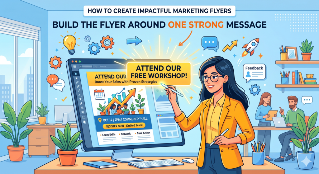
A strong message answers a simple question in the reader’s mind: “Why should I care?”
The main message should promise a clear result
A good flyer message is not just a description of what you offer. It points to a result the reader wants.
There is a big difference between saying “We offer lawn care services” and saying “Get a cleaner, greener lawn without spending your weekend on yard work.” The first one describes the service. The second one connects the service to a benefit.
The same idea applies across industries. A flyer for a web design service should not only say, “Custom websites for businesses.” It can say, “Turn more website visitors into real customer inquiries.” A flyer for a yoga studio should not only say, “Morning yoga classes.” It can say, “Start your day calmer, stronger, and more focused.”
The result does not have to be dramatic. It has to be clear and meaningful.
A focused message makes design easier
When the message is clear, the design has direction. The headline can support it. The image can show it. The body copy can explain it. The call to action can move people toward it.
But when the message is vague, design becomes decoration. The flyer may look polished, but it will not persuade. People may admire it without acting on it.
This is why copy should guide design, not the other way around. The design should make the message easier to notice, easier to understand, and easier to believe.
The message should be simple enough to repeat
A good test is this: after reading the flyer once, could someone explain the offer to a friend?
If the answer is no, the message is too complicated.
For example, “Join our 6-week small business marketing sprint and leave with a lead system you can actually use” is easier to repeat than a long explanation about strategy, branding, content, ads, analytics, and conversion planning. The second version may contain more information, but the first version is more memorable.
A flyer does not need to explain everything. It needs to create enough interest for the next step.
Every extra idea should support the main idea
This is where editing becomes important. After writing the flyer copy, look at every sentence and ask whether it supports the main message. If it introduces a new idea that does not help, cut it or save it for another marketing asset.
The flyer may lead to a landing page, a call, a store visit, or a sales conversation. That is where deeper explanation can happen. The flyer’s job is to open the door.
A strong flyer does not win by saying more. It wins by saying the right thing clearly.
Write a headline that stops the right person
The headline is the first real test of the flyer. If the headline does not earn attention, the rest of the flyer may never be read.
A flyer headline should not be clever just for the sake of being clever. It should be clear, useful, and tied to what the reader wants. Clever can work, but only when it also makes the message stronger. If the reader has to think too hard, the flyer loses.
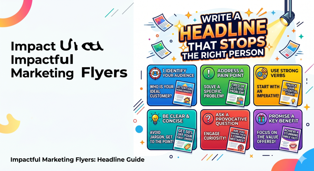
The best headline makes the right person feel, “This is for me.”
The headline should lead with value, not the business name
Many flyers waste the top space by making the company name the largest part. The brand matters, but the reader usually cares about the value first.
Unless the brand is already very famous, the headline should focus on the promise. The logo can still be visible, but it should not replace the message.
A flyer that says “Smith Family Dental” at the top may be easy to identify, but it does not create a reason to keep reading. A stronger headline might say, “A simple dental check-up for families who want gentle care close to home.” Now the reader sees a benefit, a target audience, and a reason to pay attention.
Clear headlines beat vague slogans
Vague slogans often sound nice but do not sell. Lines like “Your success starts here,” “Quality you can trust,” or “Solutions for your future” could belong to almost any business. They do not tell the reader what is being offered or why it matters.
A clear headline gives the reader something real.
For a home repair service, “Fix small home repairs before they become costly problems” is stronger than “Building better homes.” For a fitness coach, “Lose weight with simple workouts made for busy schedules” is stronger than “Unlock your best self.”
For a digital marketing agency like WinSavvy, “Get more qualified leads from your website without guessing what to fix” is stronger than “Marketing that moves you forward.”
The headline should match the flyer’s setting
Where the flyer appears affects the headline. A flyer handed out on the street needs faster impact. A flyer placed in an office waiting room can carry a slightly more thoughtful headline. A flyer mailed to homes should quickly explain relevance because it is competing with bills, notices, and other promotions.
The reader’s attention level changes by setting. Your headline should respect that.
If people are walking past, use a direct promise. If people are sitting and waiting, use a headline that invites more reading. If people receive it at home, connect it to a clear need in their daily life.
The headline should create momentum
A strong headline does not need to close the sale. It needs to make the reader move to the next line.
That is the real purpose of copywriting on a flyer. The headline leads to the subheadline. The subheadline leads to the offer. The offer leads to the proof. The proof leads to the action.
When each part creates the desire to read the next part, the flyer feels smooth. The reader does not feel pushed. They feel guided.
Make the offer easy to understand and hard to ignore
A flyer without a clear offer is easy to forget. The offer gives the reader a reason to act now instead of later.
This does not always mean a discount. A discount can work, but it is not the only kind of offer. The offer may be a free consultation, a limited-time bonus, a first visit package, a free sample, a trial class, an event seat, a helpful guide, or a simple promise that reduces risk.
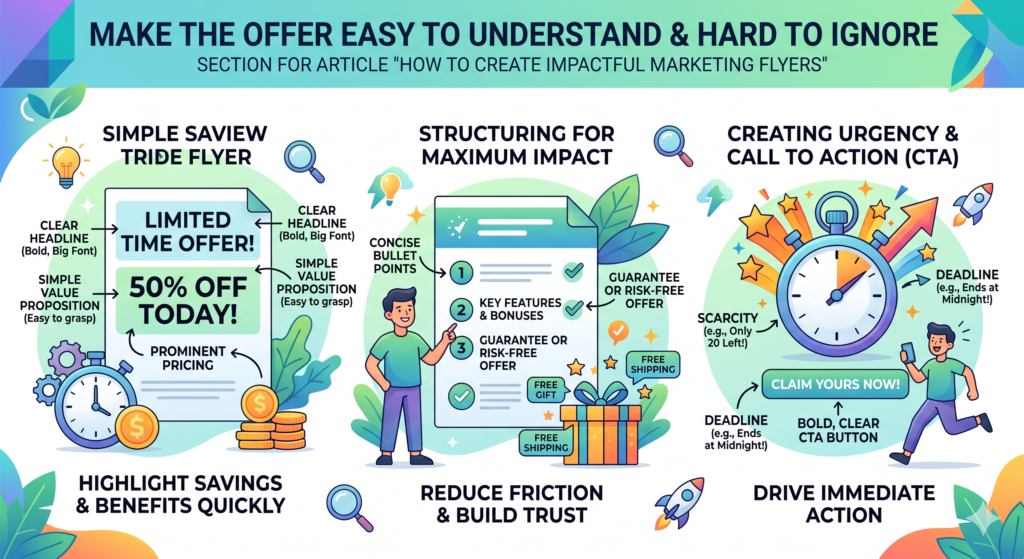
The offer should answer one question: “What do I get if I respond?”
The best offers feel specific
Specific offers are easier to believe than broad ones. “Save 20% on your first order this week” is clearer than “Great deals available.” “Book a free 20-minute website review” is stronger than “Contact us for marketing help.” “Join one free beginner class this Saturday” is stronger than “Try our classes.”
A specific offer gives the reader a mental picture. They understand what will happen next. That lowers hesitation.
When people are unsure, they delay. When the next step feels clear, they are more likely to act.
The offer should reduce risk
People often hesitate because they fear wasting time, money, or effort. A strong flyer can reduce that fear.
A service business can offer a free first call. A clinic can explain that the first consultation is simple and pressure-free. A local store can make returns clear. A coach can offer a short assessment before asking for commitment. A restaurant can offer a low-cost first meal deal.
Risk reduction matters because the flyer is often reaching people who do not know the business yet. They need a small, safe way to begin.
The offer should feel connected to the main problem
Do not add an offer just because it sounds attractive. The offer should connect to the reader’s need.
If the reader wants more leads, offer a lead audit. If the reader wants cleaner skin, offer a skin consultation. If the reader wants a better garden, offer a seasonal garden check. If the reader wants help with exam stress, offer a trial tutoring session.
The offer should feel like the first step toward the result promised in the headline.
The offer must be easy to claim
A good offer can still fail if it is hard to claim. The flyer should make the process simple. Tell the reader what to do, what they will get, and when they should do it.
Do not hide the action in small print. Do not make the reader search for the phone number or web address. Do not use a QR code without saying what it leads to. A QR code with no context feels risky. A QR code beside a line like “Scan to book your free website review” feels clear.
The easier the offer is to understand, the easier it is to accept.
Shape the flyer copy around what the reader wants most
The words on a flyer have very little time to work. A person may only give the flyer a few seconds at first. That means the copy must be clear, sharp, and useful from the first glance.
This is where many flyers become weak. They either say too little, so the reader does not understand the value, or they say too much, so the reader feels tired before taking action. Strong flyer copy sits in the middle. It gives enough detail to create interest, but not so much that it feels heavy.
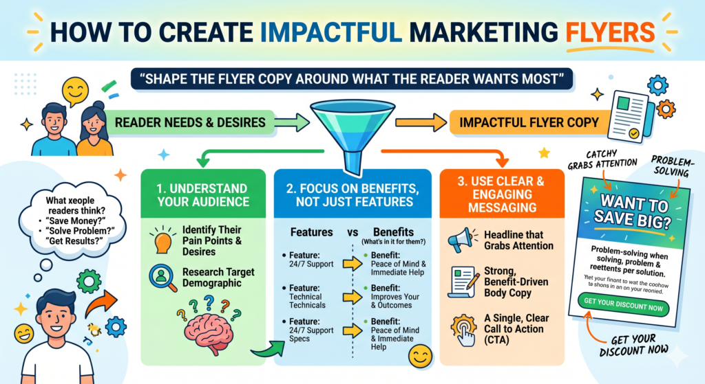
Your copy should not sound like a company talking about itself. It should sound like a helpful guide showing the reader a better next step.
The copy should focus on the reader before the brand
Most businesses want to talk about their years of experience, their services, their team, and their quality. Some of that can matter, but it should not come before the reader’s need.
A reader picks up a flyer and quietly asks, “What is in this for me?” If the flyer answers that question quickly, it earns more attention. If it starts with a long company story, it may lose them.
For example, instead of saying, “We are a full-service landscaping company with professional tools and trained staff,” you could say, “Get a neat, healthy yard without spending your weekend cutting, trimming, and cleaning.” The second line speaks to the reader’s life. It shows the value in plain words.
The best flyer copy turns features into outcomes
A feature is what the business offers. An outcome is what the customer gets from it. Flyers become stronger when they turn features into outcomes.
A gym may offer personal training, but the outcome is feeling stronger, having more energy, and knowing what to do at each workout. A web design agency may offer landing pages, but the outcome is more leads from the traffic the business already has.
A dentist may offer teeth cleaning, but the outcome is a healthier smile and more peace of mind.
This shift matters because people do not buy the tool. They buy the better situation the tool creates.
The copy should answer silent objections
Readers often have doubts they do not say out loud. They may wonder if the service is too expensive, too complicated, too far away, too risky, too slow, or not meant for them.
Good flyer copy answers the biggest doubts before they block action.
If people worry about price, show the starting offer clearly. If they worry about time, explain that the first step takes only a few minutes. If they worry about pressure, say that the consultation is friendly and no-obligation. If they worry about trust, show proof through reviews, results, credentials, or a simple guarantee.
You do not need to answer every possible doubt. You only need to answer the one or two doubts most likely to stop the reader from acting.
Every sentence should move the reader forward
Flyer copy should never feel like filler. Each sentence should help the reader understand the value, believe the promise, feel the need, or take the next step.
After writing your copy, read each line and ask, “Does this help the reader move closer to action?” If not, make it shorter or remove it.
This is one of the simplest ways to improve a flyer. Strong copy is not always about adding better words. Often, it is about removing weak ones.
Use design to guide the eye, not just decorate the page
Design is not only about making the flyer look attractive. Design has a job. It guides the reader’s eyes. It helps them notice the most important parts first. It makes the message easier to understand.
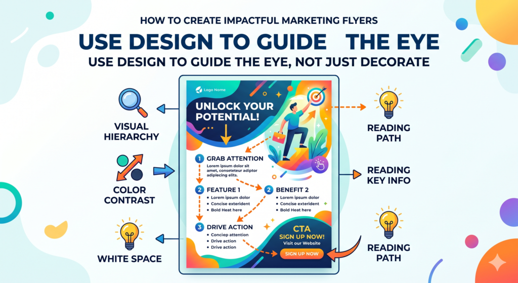
A flyer can be beautiful and still fail if the design does not support the message. It can also be simple and highly effective if the design creates clarity.
Good flyer design works like a quiet guide. It tells the reader where to look first, what to read next, and how to respond.
The most important idea should stand out first
When someone looks at the flyer, they should quickly see the main promise. This usually means the headline needs the strongest visual weight. It should not be hidden between the logo, photos, icons, and blocks of text.
Visual weight comes from size, placement, space, and contrast. A headline placed near the top, written in a readable font, surrounded by enough clean space, will usually get attention faster than a headline squeezed into a crowded layout.
The reader should not need to search for the point. The design should make the point obvious.
White space makes the flyer feel easier to read
Many people think empty space is wasted space. It is not. Empty space gives the reader’s eyes room to rest. It also makes the important parts feel more important.
When every inch is filled, nothing stands out. The flyer feels loud. A reader may glance at it and feel that it will take too much effort to understand.
White space can make a flyer feel more premium, more trustworthy, and more organized. It helps the headline breathe. It separates the offer from the details. It makes the call to action easier to find.
A flyer does not need to be empty, but it does need breathing room.
The layout should follow a natural reading path
Most people read from top to bottom and from the most noticeable element to the next most noticeable element. Your flyer should use that habit.
A simple flow often works best. First, the reader sees the headline. Then they see the supporting line. Then they notice the offer. Then they see proof. Then they find the call to action.
This path should feel smooth. If the reader’s eye jumps around the flyer without knowing where to go, the design needs more order.
Design choices should match the offer
The visual style should fit the promise. A flyer for a luxury spa should not look like a loud clearance sale. A flyer for a children’s event should not look cold and corporate. A flyer for a law firm should not feel playful and random.
The design creates a feeling before the reader processes the words. That feeling should match the brand and the action you want the reader to take.
If the offer is serious, the design should feel calm and credible. If the offer is fun, the design can feel bright and lively. If the offer is urgent, the design can use stronger contrast and sharper calls to action.
Choose images that support the message clearly
Images can make a flyer stronger, but only when they serve the message. A good image helps the reader understand the benefit faster. A weak image takes space without adding meaning.
Many flyers use generic stock photos that look polished but feel empty. A smiling person, a random handshake, or a perfect office scene may look professional, but it may not help the reader understand why the offer matters.
The image should not be there only because the flyer “needs a picture.” It should make the message easier to feel.
The image should show the desired result
The strongest images often show the result the customer wants. A restaurant flyer should make the food look fresh and tempting. A cleaning service flyer should show a clean, peaceful room. A fitness flyer should show the feeling of progress, not just equipment. A tutoring flyer should show confidence and support, not only books.
The image should answer the emotional side of the offer. Words explain. Images make people feel.
When the image and headline work together, the flyer becomes easier to understand in one glance.
Real images can build more trust than perfect images
In many cases, real photos work better than polished stock images. A real photo of the store, team, product, customer result, event space, or work process can make the business feel more believable.
This is especially true for local businesses. People want to know that the business is real, nearby, and approachable. A real photo can create that trust faster than a generic image.
The photo does not need to be expensive, but it should be clear, bright, and intentional. Poor lighting, cluttered backgrounds, and blurry images can hurt trust. The goal is to feel real without looking careless.
Do not let the image fight the text
Images can also create problems when they make text hard to read. If text is placed over a busy photo, the reader may struggle. If the image has too many colors or details, it can compete with the headline.
The image should support the copy, not fight it.
If you place text on an image, use a clean area of the photo or add enough contrast so the words are easy to read. Never make the reader work hard to read the message. If people have to squint, they will not continue.
One strong image is often better than many weak ones
Some flyers use too many images because the business wants to show everything. A salon may show hair, nails, makeup, skincare, and the store interior. A real estate flyer may show many tiny property photos. A service flyer may show several icons and pictures at once.
This often weakens the impact.
One strong image can create a clearer impression than six small images. If more images are needed, they should be used with care and order. The goal is not to show everything. The goal is to make the reader want the next step.
Make the call to action impossible to miss
The call to action is where attention turns into action. Without it, even a beautiful flyer can fail.
A reader should never finish the flyer and wonder what to do next. The next step should be direct, clear, and easy. It should feel like the natural answer to the promise and offer.
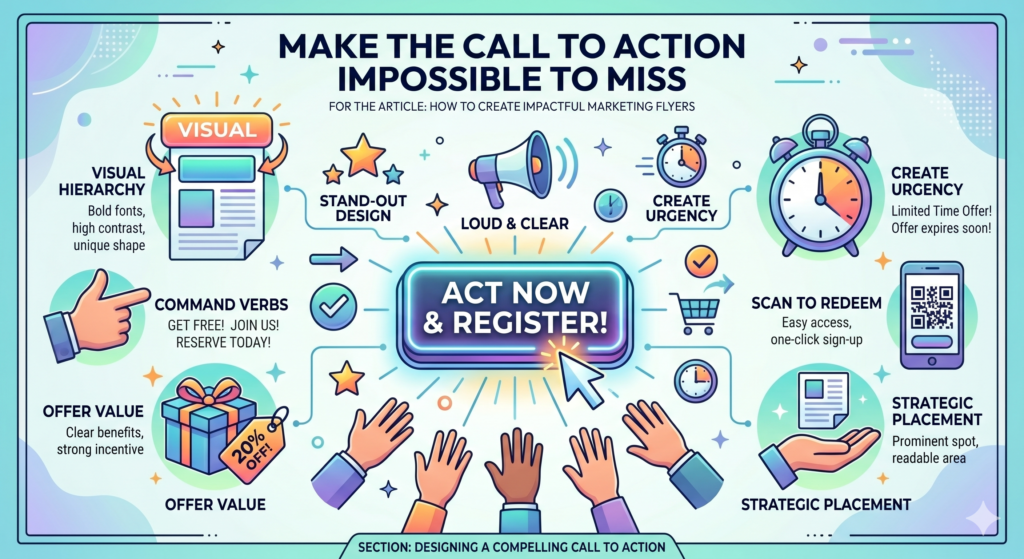
A strong call to action is not just “Contact us.” That is too plain. It does not remind the reader what they get. A better call to action connects the action to the result.
The action should be specific and simple
A flyer should tell people exactly what to do. Call today. Scan to book. Visit this weekend. Bring this flyer. Reserve your seat. Claim your free review. Order online. Get your first class free.
Specific action creates less confusion.
If you use a QR code, tell people what happens after they scan it. A QR code beside “Scan here” is weaker than a QR code beside “Scan to book your free 20-minute consultation.” The second version gives the reader a reason to scan.
The call to action should appear where people expect it
Most flyers place the call to action near the bottom because that is where the reader ends. This can work well. But if the flyer is longer or folded, the action may also need to appear more than once.
The key is that the call to action should be easy to find. It should have enough space around it. It should not be buried in small text or hidden beside too many details.
If the flyer includes a phone number, website, address, and QR code, arrange them clearly. Do not make them compete. The main action should stand out most.
The action should feel low effort
People are busy. Even if they like the offer, they may delay if the action feels hard.
A good flyer makes the first step feel small. Instead of asking someone to “Start your full transformation today,” ask them to “Book a free 15-minute call.” Instead of asking them to “Become a member now,” ask them to “Try one class this Saturday.” Instead of asking them to “Hire us for your marketing,” ask them to “Get a free lead review.”
Small steps reduce pressure. Lower pressure often leads to more responses.
Urgency should be real, not forced
Urgency can improve response, but fake urgency damages trust. If every flyer says “limited time offer” without a real reason, people stop believing it.
Real urgency comes from a true deadline, limited seats, seasonal timing, event dates, first-time offers, or a limited number of free consultations.
For example, “Book by Friday to get your free setup session” feels more real than “Act now before it is too late.” Clear urgency works better than dramatic urgency.
Add proof that makes the promise easier to believe
A flyer makes a promise. Proof helps the reader believe it.
This is especially important when the reader does not know the business yet. They may like the offer, but still wonder if the business can deliver. Proof lowers that doubt.
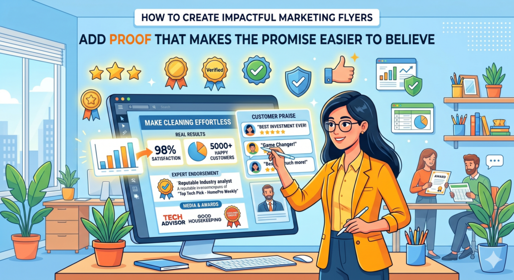
Proof does not need to take up much space. Even a short review, a clear result, a trust badge, a real number, a client name, or a before-and-after image can make the flyer more convincing.
The right proof depends on the kind of business
Different offers need different kinds of proof. A local restaurant may use ratings, food photos, or customer comments. A real estate agent may use homes sold, neighborhood knowledge, or client results. A coach may use testimonials and transformation stories. A marketing agency may use case results, client growth, or a clear process.
The proof should match the reader’s concern.
If the reader worries about quality, show quality proof. If they worry about trust, show trust proof. If they worry about results, show result proof. If they worry about safety, show credentials or experience.
Short testimonials can work well on flyers
A testimonial does not need to be long. In fact, shorter is often better on a flyer. A single clear sentence from a happy customer can add a human voice to the message.
The best testimonials are specific. “Great service” is nice, but it is not strong. “We got three new client calls in the first week after the website changes” is stronger because it shows a result. “My son finally stopped feeling scared of math tests” is stronger because it shows a meaningful change.
A flyer has limited space, so choose proof that says a lot with a little.
Numbers can build trust when they are clear
Numbers can make a flyer feel more credible, but only when they are easy to understand. A number should support the promise, not confuse the reader.
For example, “Trusted by 240 local homeowners” is simple. “Over 1,500 meals served every week” is simple. “Average 32 percent increase in qualified leads across recent campaigns” can work for a marketing agency if the audience is business owners who care about results.
Do not add numbers just to look impressive. Add numbers that help the reader believe the offer.
Proof should not overcrowd the flyer
Proof is powerful, but too much proof can make the flyer crowded. You do not need five testimonials, ten logos, and a full case study. Choose one or two strong proof points and give them space.
The flyer should create enough trust for the next step. The landing page, sales call, or brochure can carry deeper proof later.
A strong flyer does not need to prove everything. It only needs to prove enough for the reader to act.
Keep the flyer simple enough to understand in five seconds
A flyer does not get the same attention as a book, a sales page, or a long email. Most people will not sit down and study it. They will glance at it, decide if it matters, and either keep reading or move on.
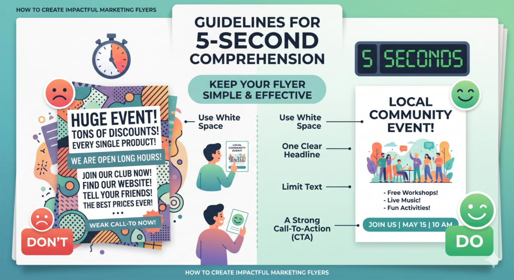
That means your flyer must pass the five-second test.
In five seconds, the reader should understand what is being offered, who it is for, why it matters, and what to do next. They do not need every detail right away. They need enough clarity to keep going.
Simplicity is not the same as being basic. It is about making the message easy to receive.
A simple flyer makes one idea feel strong
When a flyer tries to say too many things, every idea becomes weaker. The headline fights with the offer. The service list fights with the image. The discount fights with the brand story. The contact details fight with the proof.
The reader should not feel like they are sorting through a puzzle.
A strong flyer has one main idea. Everything else supports that idea. If the flyer is about getting a free roof inspection before the rainy season, stay close to that message. Do not also try to explain every roofing service, every type of material, every company value, and every past project.
Remove anything that does not help the next step
Editing is one of the most important parts of flyer creation. Most first drafts include too much information because the business wants to be safe. They think that if they say more, they will convince more people.
Usually, the opposite happens.
Too much information makes the reader work harder. A flyer should make action feel easy, not heavy. After writing the copy, look for lines that repeat the same idea, add weak praise, or explain things the reader does not need yet.
For example, a line like “We are committed to providing high-quality customer-focused services that meet your needs” sounds professional, but it does not say much. A clearer line would be, “Get your first repair quote within 24 hours.” That is specific. It helps the reader understand the value.
Use plain words that people can process quickly
Simple words are stronger on flyers because they are faster to understand. A flyer is not the place to sound complex. It is the place to be clear.
Instead of “comprehensive home maintenance solutions,” say “home repairs done fast and properly.” Instead of “optimize your online presence,” say “get more leads from your website.” Instead of “culinary experience,” say “fresh meals made daily.”
Simple words do not make the brand look less smart. They make the message easier to act on.
The flyer should feel calm, not crowded
A crowded flyer creates stress. A calm flyer creates trust.
This does not mean every flyer must look minimal. Some flyers can be bright, bold, and energetic. But even a bold flyer needs order. The reader should know where to look first, what matters most, and how to respond.
A calm flyer has enough space, clear sections, readable text, and a strong visual path. It does not make the reader feel trapped in details.
Use color with purpose instead of using color for decoration
Color can help a flyer stand out, but color should not be chosen only because it looks nice. It should support the message, the brand, and the action.
The wrong colors can make a flyer feel cheap, confusing, or hard to read. The right colors can make the offer feel more trustworthy, more exciting, more premium, more fresh, or more urgent.
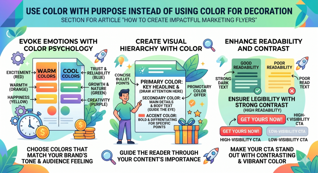
Color is part of the message, even when no words are attached to it.
The main color should match the feeling you want to create
Different colors create different moods. A health clinic may want calm, clean, and safe colors. A children’s event may want bright and cheerful colors. A luxury service may want soft, rich, or restrained colors. A sale flyer may use stronger contrast to create energy.
The point is not to follow strict color rules. The point is to be intentional.
If the flyer is for a serious service, too many bright colors can weaken trust. If the flyer is for a fun event, dull colors can reduce excitement. If the flyer is for a premium product, loud colors may make it feel less premium.
Contrast matters more than decoration
The most important job of color is readability. People should be able to read the flyer quickly, even from a short distance.
Light gray text on a white background may look elegant on a screen, but it can be hard to read in print. Yellow text on a white background is often too weak. Dark text on a light background is usually easier. Strong contrast helps the headline, offer, and call to action stand out.
If the flyer will be printed, test the colors before finalizing. Some colors look different on paper than they do on a screen. What feels bright online may look dull when printed.
Use one action color for the call to action
A smart way to use color is to give the call to action its own clear color. This helps the reader find the next step fast.
For example, if most of the flyer uses calm brand colors, the button-style call to action can use a stronger color. This does not mean the flyer needs an actual button, especially in print. It means the action area should visually stand out.
If every part of the flyer uses bright color, the call to action may not stand out. When everything shouts, nothing is heard.
Keep the color palette tight
Too many colors can make a flyer look messy. A tight color palette feels more professional and easier to read.
Most flyers work well with one main brand color, one support color, and one strong action color. Neutral colors like white, black, cream, or gray can help balance the design.
The goal is not to make the flyer colorful. The goal is to make the message clear and memorable.
Choose fonts that make the flyer easy to read
Fonts can change how a flyer feels. They can make it look modern, friendly, premium, playful, serious, or cheap. But the most important job of a font is simple: people must be able to read it without effort.
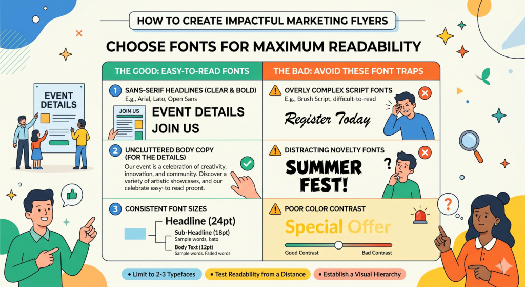
A flyer is not the place to use fonts that look clever but slow people down. If the reader struggles to read the headline or contact details, the design has failed.
Good font choices make the message feel smooth.
Readability should come before style
Some fonts look beautiful in a logo or on a large poster, but they do not work well for flyer text. Very thin fonts, overly decorative fonts, and tightly spaced fonts can become hard to read, especially after printing.
The headline can have more personality, but it should still be clear. The body text should be simple and clean. Contact details should be especially easy to read because they are tied to action.
A flyer that looks creative but cannot be read quickly will lose leads.
Use font size to show what matters most
Font size helps create order. The biggest text should usually be the main headline. The next largest text may be the offer or subheadline. Smaller text can explain details. The smallest text should only be used for less important notes, not for key information.
Do not make everything large. When all text is large, the flyer feels crowded and the reader cannot tell what matters most.
Do not make everything small either. A flyer should be readable at a glance. If people need to bring it close to their face, the text is too small.
Avoid using too many font styles
Too many fonts can make a flyer feel unplanned. It can also make the reader’s eyes jump around.
A clean flyer often uses one or two font families. One can be used for the headline, and another can be used for body text. You can create variety with size, weight, and spacing instead of adding more fonts.
The flyer should feel like one clear message, not a collection of random design pieces.
Make contact details highly readable
The phone number, website, address, date, time, and QR code instructions must be easy to read. These details are often placed at the bottom, but they should not feel like an afterthought.
A person may be ready to act and then stop because they cannot quickly find the phone number or understand the address. That is a painful way to lose a lead.
Use simple text, enough spacing, and clear contrast for action details. The easier it is to respond, the more likely people are to do it.
Write body copy that sells without sounding pushy
A flyer needs to persuade, but it should not feel like it is shouting. Pushy copy can make people defensive. Clear, helpful copy makes people feel guided.
The best flyer copy does not beg for attention. It earns attention by being useful and relevant. It shows the reader that the offer fits their need and that the next step is worth taking.
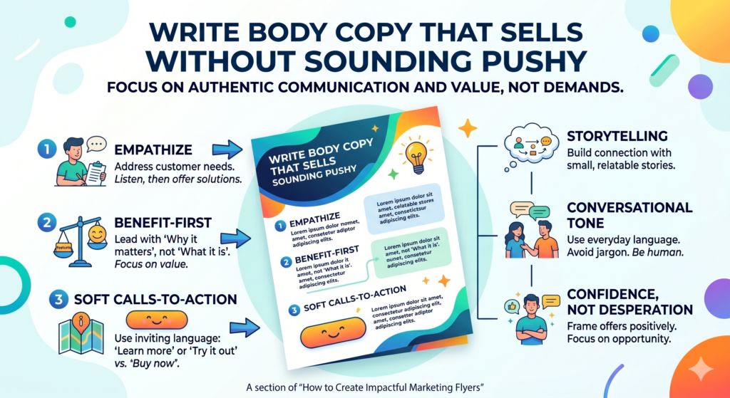
Strong body copy often feels like a short conversation. It meets the reader where they are and moves them toward action with confidence.
Start with the pain or desire the reader already feels
Good body copy usually begins with something the reader already understands. This could be a problem, a desire, or a moment in their daily life.
For example, a flyer for a meal delivery service could say, “When your day is packed, dinner should not become another task.” That line speaks to a real feeling. It is simple, but it connects.
A flyer for a marketing audit could say, “If your website gets visits but not enough leads, the problem may not be traffic. It may be what people see after they land.” That line helps the reader see the issue more clearly.
Move from problem to better outcome
After naming the problem or desire, the copy should show the better outcome. This is where the offer becomes useful.
Do not stay too long in the pain. You are not trying to scare the reader. You are trying to show that you understand the problem and have a clear next step.
A good flow might be: here is the problem, here is why it matters, here is the better result, and here is how to start.
This gives the flyer a natural shape. It does not feel random.
Use active words that create movement
Flyer copy should feel alive. Weak copy often uses flat phrases like “services available” or “solutions provided.” These lines do not create movement.
Use words that help the reader picture action. Get, book, start, visit, try, claim, bring, scan, join, call, save, fix, learn, plan, compare, improve. These words are simple, but they guide people.
For example, “Get your free quote today” feels clearer than “Free quotes are available.” “Start with one trial class” feels clearer than “Trial classes are offered.”
The reader should feel that action is simple and close.
Keep the body copy tight but meaningful
Short copy does not mean shallow copy. You can say something useful in a few lines if each line has a job.
Avoid long background stories on the flyer. Save those for the website or sales conversation. Use the body copy to explain the value, reduce one major doubt, and connect the offer to action.
A strong flyer gives the reader just enough information to say, “This seems worth checking out.”
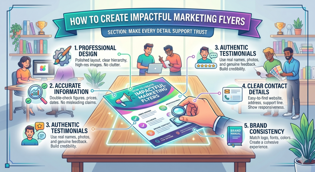
Make every detail support trust
Trust is a major part of flyer performance. People may see the offer and like it, but they still need to feel safe enough to act.
This is especially true for services that involve money, health, home, family, business, or personal results. The more important the decision feels, the more trust the flyer must build.
Trust does not come from one big statement. It comes from many small signals working together.
A professional flyer makes the business feel more reliable
People judge the business by the flyer. If the flyer looks rushed, messy, or unclear, they may assume the business operates the same way.
This may not be fair, but it happens.
A clean flyer shows care. It tells the reader that the business pays attention to details. Spelling errors, low-quality images, uneven spacing, and unclear contact details can all reduce trust.
Before printing or sharing the flyer, check every detail. Read the copy out loud. Check the phone number. Test the QR code. Confirm the address, date, time, offer terms, and website link.
Clear terms prevent confusion
If the flyer includes an offer, make the basic terms clear. This does not mean filling the flyer with fine print. It means avoiding confusion that could hurt trust later.
If the discount applies only to first-time customers, say so. If the offer ends on a certain date, include it. If booking is required, mention it. If seats are limited, make that clear.
People do not like feeling tricked. Clear terms help the offer feel honest.
Brand consistency builds recognition
A flyer should feel connected to the rest of the brand. The colors, logo, tone, and offer should match what people see on the website, social media, storefront, or landing page.
If the flyer feels one way and the website feels completely different, trust can drop. The reader may wonder if they are in the right place.
This matters even more when using QR codes. The page people land on should continue the same promise. If the flyer says “Book your free website review,” the landing page should not send them to a generic homepage. It should take them directly to the review offer.
Contact information should feel complete
A flyer with only a social media handle may work for some casual offers, but many businesses need more complete contact details. A phone number, website, address, email, or clear booking link can make the business feel more real.
Choose the contact method that fits the action. If people need to book fast, use a phone number or booking link. If they need to visit, include the address and hours. If they need to learn more, use a landing page.
The reader should never feel uncertain about how to reach you.
Design the flyer for where it will be used
A flyer should not be designed in isolation. Where it will be seen changes how it should look and what it should say.
A flyer handed to someone in a busy street has a different job from a flyer placed on a café counter. A flyer mailed to homes has a different job from one shared as a digital image. A flyer placed inside a product package has a different job from one posted on a community board.
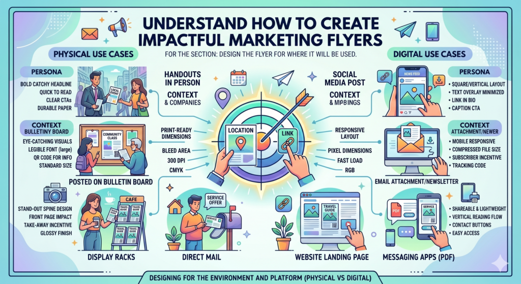
The setting affects attention, reading time, and action.
A handout flyer needs fast clarity
When someone receives a flyer by hand, they often decide quickly whether to keep it. The headline and visual need to work fast. The offer should be clear right away.
The person may be walking, talking, or distracted. This is not the time for a dense design. Use a bold headline, simple offer, strong visual, and clear call to action.
A handout flyer should also make sense without explanation. The person handing it out may say a few words, but the flyer should still stand on its own.
A counter flyer can carry slightly more detail
A flyer placed at a front desk, café counter, clinic, gym, or store may get more reading time. People may pick it up while waiting. This gives you room to add a little more context.
Even then, do not overcrowd it. The flyer still needs a clear message. But you may be able to include a short explanation, a testimonial, a small process section, or more details about the offer.
The key is to match the reader’s patience in that setting.
A mailed flyer must prove relevance quickly
Mail flyers compete with many other items. The reader may sort through them quickly and throw away anything that does not feel relevant.
For mailed flyers, local relevance can be powerful. Mentioning the area, a seasonal need, or a household problem can help. A line like “Roof checks for homes in the Riverside area before storm season” feels more relevant than a broad line like “Professional roofing services.”
Mail flyers also need a strong reason to keep them. A clear coupon, useful reminder, event date, or limited offer can help the flyer survive the first sorting moment.
A digital flyer needs mobile readability
Many flyers are now shared through WhatsApp, email, social media, and community groups. A digital flyer may be viewed on a small phone screen. This changes the design.
Text must be larger. The message must be simpler. Tiny details will be missed. QR codes may not be useful if someone is already viewing the flyer on the same phone, so include a clickable link in the message that accompanies the flyer.
A digital flyer should still be designed like a flyer, but it must be tested on a phone before sharing. If it cannot be read easily on a small screen, it needs revision.
Match the flyer format to the amount of information people need
Flyer format affects how much people read, how they hold the piece, and how much space you have to persuade them. Many businesses choose a format based only on cost or template size. That can work for simple offers, but it can also limit the flyer before the message has a chance to do its job.
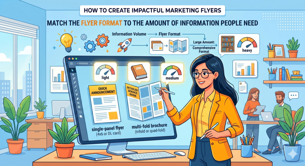
A small flyer can work well for a simple offer. A larger flyer may be better when the reader needs more trust or more detail. A folded flyer may work when the information needs to be separated into clear parts. The format should match the job.
If the offer is easy to understand, keep the format simple. If the offer needs explanation, choose a format that gives the message room to breathe.
A small flyer works best when the action is simple
Small flyers are useful when the reader does not need much education. A café discount, event invite, gym trial class, shop opening, salon offer, or local service promotion can often work well on a half-page or small handout.
The main risk with a small flyer is overcrowding. Because the space is limited, every word has to matter. You may only have room for the headline, offer, proof, image, and call to action. That is not a weakness. It can actually make the flyer stronger if the message is clear.
A small flyer should not try to act like a full brochure. It should create fast interest and push one next step.
Larger flyers can support higher-trust offers
A larger flyer gives you more space, but that does not mean you should fill every inch. The extra room should be used to make the message easier to understand, not heavier.
For higher-trust offers, a larger flyer can help you explain the problem, show proof, describe the process, and include a stronger call to action. This can work well for coaching, medical services, home improvement, education, real estate, financial services, and B2B offers.
The reader may need to believe more before acting. A larger format gives you space to build that belief in a calm way.
Folded flyers help when the message has stages
A folded flyer can be useful when the reader needs to move through information step by step. The front panel can create interest. The inside can explain the value. The back can carry proof, contact details, and the call to action.
This format works well when the service is not instantly understood. It can also work for events, programs, menus, packages, or service bundles.
The mistake is treating each panel as a separate flyer. The panels should connect. The reader should feel guided from first glance to final action.
The format should never make the message harder
Sometimes businesses choose unusual shapes or complex folds to stand out. That can work, but only if it still helps the message.
If the reader has to figure out how to open the flyer, where to start, or what order to read, the format is getting in the way. Creative format should make the flyer more memorable, not more confusing.
The best format is the one that helps the right person understand the offer faster and act with less doubt.
Create a clear visual hierarchy before you design the final layout
Visual hierarchy means the order in which people notice things. On a strong flyer, the reader does not see all parts equally. They see the most important part first, then the next most important part, and then the details.
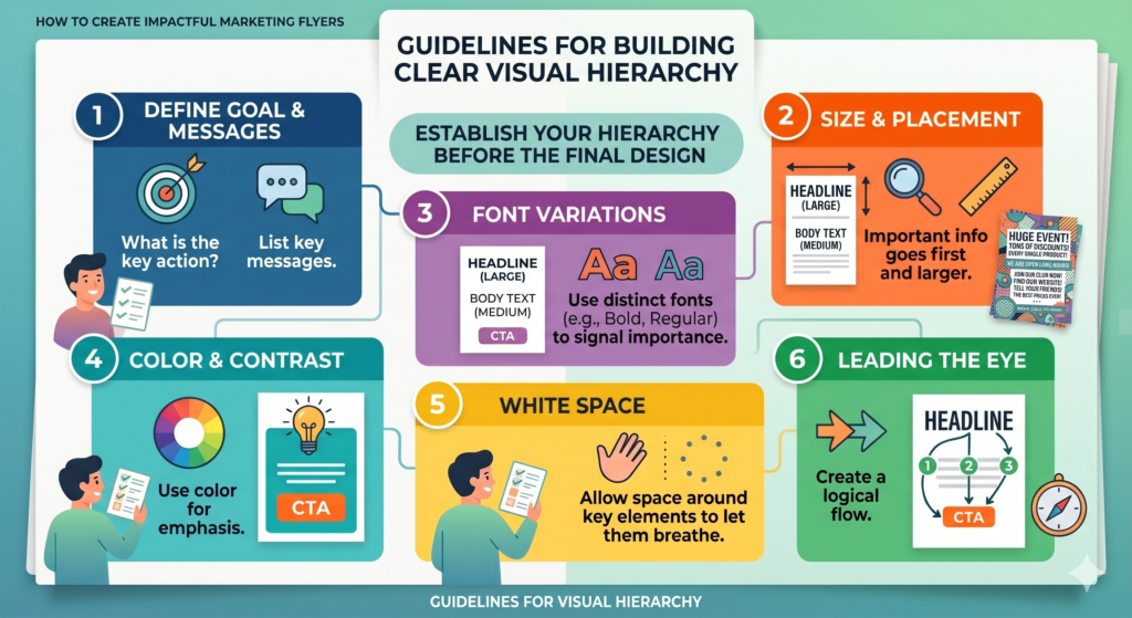
This order is not accidental. It is planned.
Without hierarchy, a flyer feels noisy. The headline, photo, logo, offer, social icons, and contact details all fight for attention. When everything looks important, the reader cannot tell what matters.
A clear hierarchy helps the flyer feel easy even when it contains several pieces of information.
Decide what the reader should notice first
The first thing people notice should usually be the main promise or strongest offer. This is the hook. It tells the reader why the flyer matters.
If the logo is the first thing they see, but they do not know the brand, attention may fade. If the image is the first thing they see, but it does not clearly show the benefit, the message may be missed. If the discount is the first thing they see, but the reader does not know what the discount is for, it can create confusion.
The first visual moment should create meaning.
The second thing should deepen interest
After the headline, the reader needs a reason to keep going. This can be a subheadline, a short benefit line, or a simple explanation of the offer.
For example, a headline may say, “Bring more local customers through your doors.” The next line can explain, “Get a simple marketing flyer and landing page plan built around one clear offer.” The headline creates desire. The second line makes the promise more concrete.
The second layer should not repeat the headline. It should add clarity.
The third thing should build trust or urgency
Once the reader understands the offer, they may need a reason to believe it or act soon. This is where proof, urgency, or risk reduction can help.
A short review, a rating, a client result, a deadline, or a limited opening can make the message stronger. It should not feel forced. It should support the decision.
For a local service, trust may matter more than urgency. For an event, urgency may matter more because the date is fixed. For a first-time offer, risk reduction may be the most important part.
The final thing should be the action
The call to action should feel like the obvious next step. It does not always have to be the largest element, but it must be easy to find.
A reader should be able to glance at the flyer and know exactly how to respond. If the action is hidden, the flyer leaks results.
Before finalizing the design, look at the flyer from a distance. Then look at it quickly for only a few seconds. If the order is not clear, the hierarchy needs work.
Use the back of the flyer with a clear purpose
If your flyer is printed on both sides, the back should not be treated as leftover space. It should have a job.
Many businesses make the front strong and then use the back as a dumping ground for extra information. They add long service lists, small terms, social icons, random photos, and long company text. This weakens the piece.
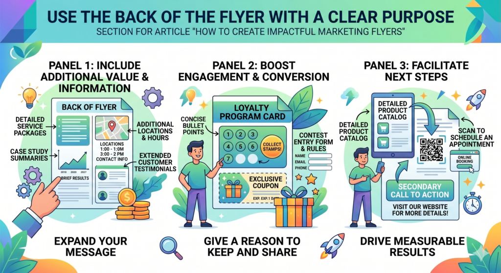
The back of the flyer can be very powerful when it continues the message in a planned way.
The back should answer what the front made people curious about
The front of the flyer should create attention. The back should build belief.
If the front makes a strong promise, the back can explain how the business delivers it. If the front promotes an offer, the back can show what is included. If the front invites people to an event, the back can explain who should attend and what they will learn.
This gives the flyer a natural flow. The front earns attention. The back rewards attention.
Use the back for proof when trust matters
The back is a great place for proof. You can include a short testimonial, a small case result, a before-and-after example, or a simple explanation of your process.
For a service business, this can make the flyer feel more serious. For example, a marketing agency flyer could use the back to show how a website audit works, what the business owner gets, and what kind of improvements are usually reviewed. This turns a vague offer into something more believable.
Proof on the back should still be simple. The reader should not feel like they are reading a report.
Use the back to explain the process
People are more likely to act when they know what will happen next. The back of the flyer can explain the first step in plain words.
For example, you might say that the reader books a short call, shares their goal, gets a simple review, and receives next-step advice. This removes uncertainty.
A process does not need to be shown as a list. It can be written as a short paragraph that explains the experience in a calm and helpful way.
Do not hide the call to action only on the back
If the flyer has two sides, the call to action should appear on both sides or be easy to find from either side. Some readers may only look at the front. Others may turn it over. Both should know what to do.
The back can include full contact details, but the front should still show the main action. Never make the reader work to respond.
Make the flyer feel local, timely, and relevant when possible
A flyer often works best when it feels connected to the reader’s real world. Local details, seasonal timing, and current needs can make the message feel more relevant.
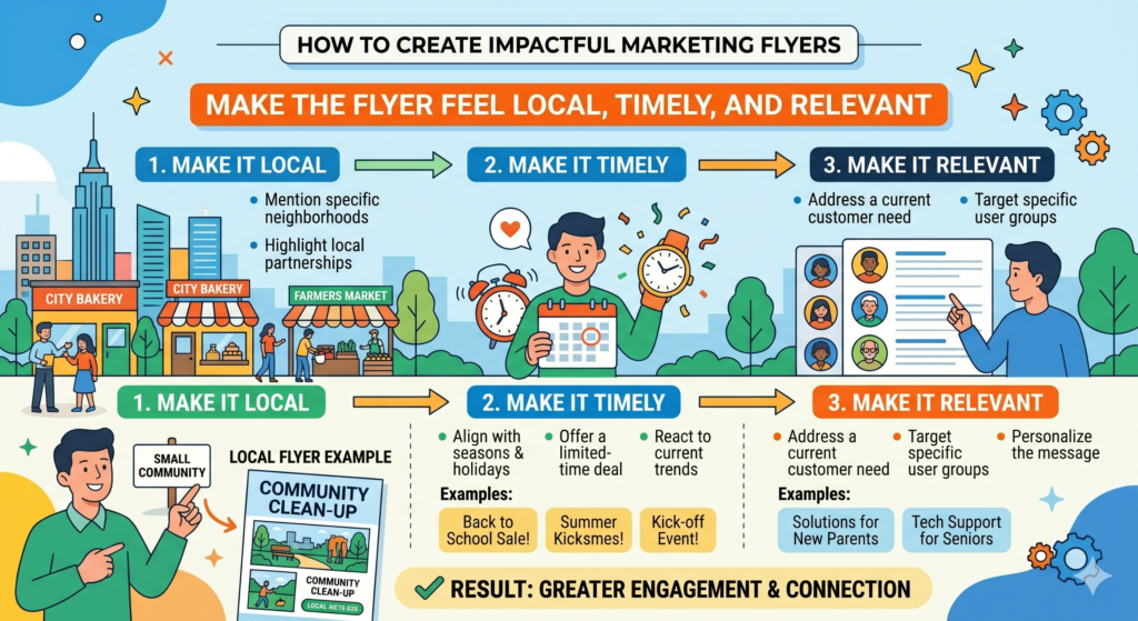
A broad flyer says, “We offer home cleaning services.” A more relevant flyer says, “Get your home guest-ready before the holiday rush.” The service may be the same, but the second message connects to a real moment.
Relevance makes the flyer feel less like random advertising and more like a helpful reminder.
Local details can increase trust
If you serve a local area, say so clearly. People often prefer nearby businesses because they feel easier to reach and more accountable.
A local line can be simple. You can mention the neighborhood, city, service area, nearby landmark, or local customer base. The goal is not to overdo it. The goal is to help the reader think, “This is for people like me, near me.”
For example, a line like “Helping small businesses in Austin get more local leads” feels more specific than “Helping businesses grow.” It tells the reader the business understands the local market.
Seasonal timing makes the offer feel more urgent
Seasonal flyers work because they connect to what people already have on their minds. A tax service can promote help before filing deadlines. A gym can promote a new-year reset. A lawn care company can promote spring cleanups. A tutor can promote exam prep. A restaurant can promote holiday catering.
The timing gives the reader a reason to act now.
This is stronger than fake urgency because it is based on a real moment. The reader understands why the offer matters today.
Events and deadlines create natural action
If the flyer is for an event, workshop, launch, opening, or limited campaign, the date should be easy to see. People need to know when action is required.
Do not bury the date in small text. A date can be part of the main message if timing is important. For example, “Free beginner yoga class this Saturday” is stronger than a generic yoga flyer with the date hidden near the bottom.
A clear date helps people decide quickly.
Relevance should not make the flyer too narrow unless that is the goal
Specificity is powerful, but it should be used with care. If your offer is only for first-time homebuyers, say that. If your event is only for restaurant owners, say that. But if you serve a wider group, do not make the flyer so narrow that good prospects think it is not for them.
The best flyer feels specific enough to be meaningful, but not so narrow that it blocks the right people.
Conclusion
An impactful marketing flyer is not created by chance. It is built with clear thinking, sharp writing, careful design, and a strong understanding of the reader.
The goal is not to fill a page. The goal is to move a person. That movement may be a call, a scan, a visit, a booking, a purchase, or a saved reminder for later. Whatever the action is, the flyer should make it feel simple and worth taking.


Comments are closed.